Buttons
This page provides details on the component Button in the screen composer
General overview
A button is a generic clickable Screen component that can be mapped with different actions.
Configuration
Structure of a button
Here is the structure of a button:
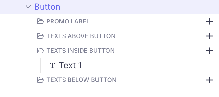
It is composed of a parent element (highlighted in the image above) and a set of text collections.
When mapped with a Purchase action (to trigger the In-App Purchase flow), button are directly mapped with They are different from the component CTA for Plan picker, which work with a Plan picker and require the user to first choose a plan using the Pickers and then click on the CTA to trigger the Purchase.
Eg: in the Sticky button layout, the Plan picker can be put in the surface Body, and the CTA for Plan picker can be associated to the surface Bottom bar, to be always visible to the user.
Configuring the action associated with the button
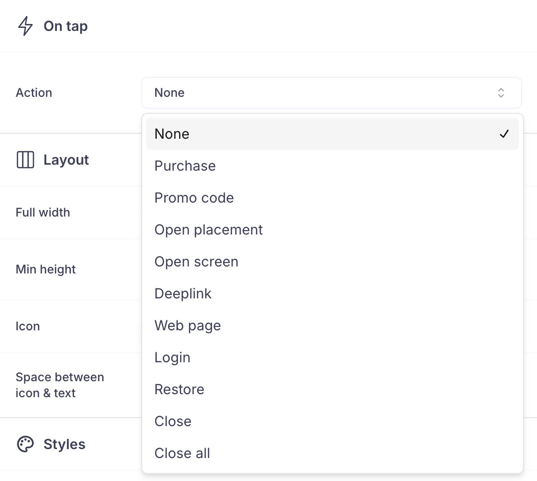
Here is the list of actions that can be associated with a button:
-
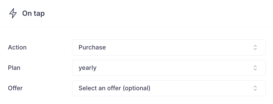
Purchase: a tap on the button will trigger an In-App Purchase Flow.-
The Plan (and optionally the Promotional Offer) can be associated directly to the button
-
-
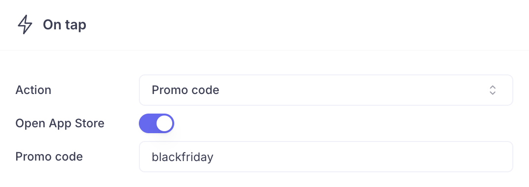
Promo code: a tap on the button will trigger the Promo code redemption flow.-
On iOS, the promo-code can be redeemed in the app: in this case the user has to enter the promo code manually (which means that you should display it on the Screen itself)

-
Or inside the App Store: in this case you must enter the associated promo code. The user will be redirected in the App Store to redeem it and the promo code will be pre-filled.
-
-
Open placement: a tap on the button will open the associated Placement
-
Open Screen: a tap on the button will open the associated Screen
-
Deeplink: a tap on the button will open the associated deeplink
-
Web page: a tap on the button will open the associated web page in the web browser
-
Login: a tap on the button will handover the control to the app (using the Paywall action interceptor) and provide the value "Login", so that the app can display the sign-in form
-
Restore: a tap on the button will trigger the restore purchases action
-
Close: a tap on the button will close the current Screen
-
Close all: a tap on the button will close the current Screen and all the Purchasely Screens previously opened
Configuring the Texts associated with the button
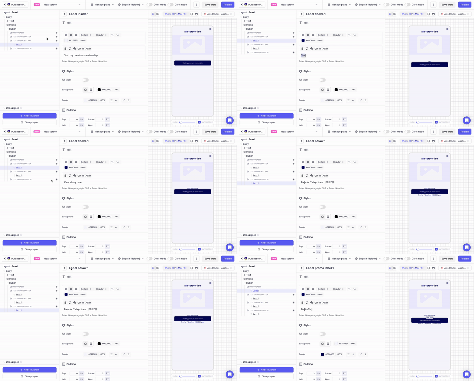
A button has 4 different collections of Texts:
- promo label
- Texts above button
- Texts inside button
- Texts below button
Each collection can be associated with 1 to 4 Texts. Click on the + button to add a new Text.
Leveraging tags
Tags can be used inside Texts. You can either type them directly in plain text by putting them between pairs of curly brackets (eg: {{PRICE}} {{AMOUNT}} {{DURATION}}). You can also click on the {{TAGS}} button in the bar just above the text input.
If you want the tag to refer to the button mapped with the element, choose the option "Use element's plan / default plan" after selecting your tag:
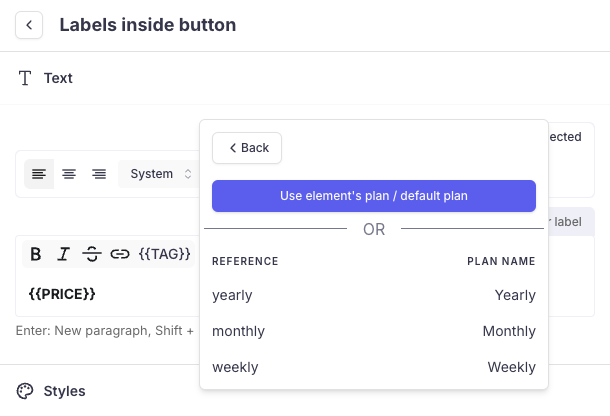
- In this case, the tag should appear without parameters when displayed in the text field.
- The advantage is that the tag will automatically be updated when another picker gets selected
If you want the tag to refer to another Plan (eg: to strike through a former price), you can pick the desired Plan directly
Configuring the Promo overlay
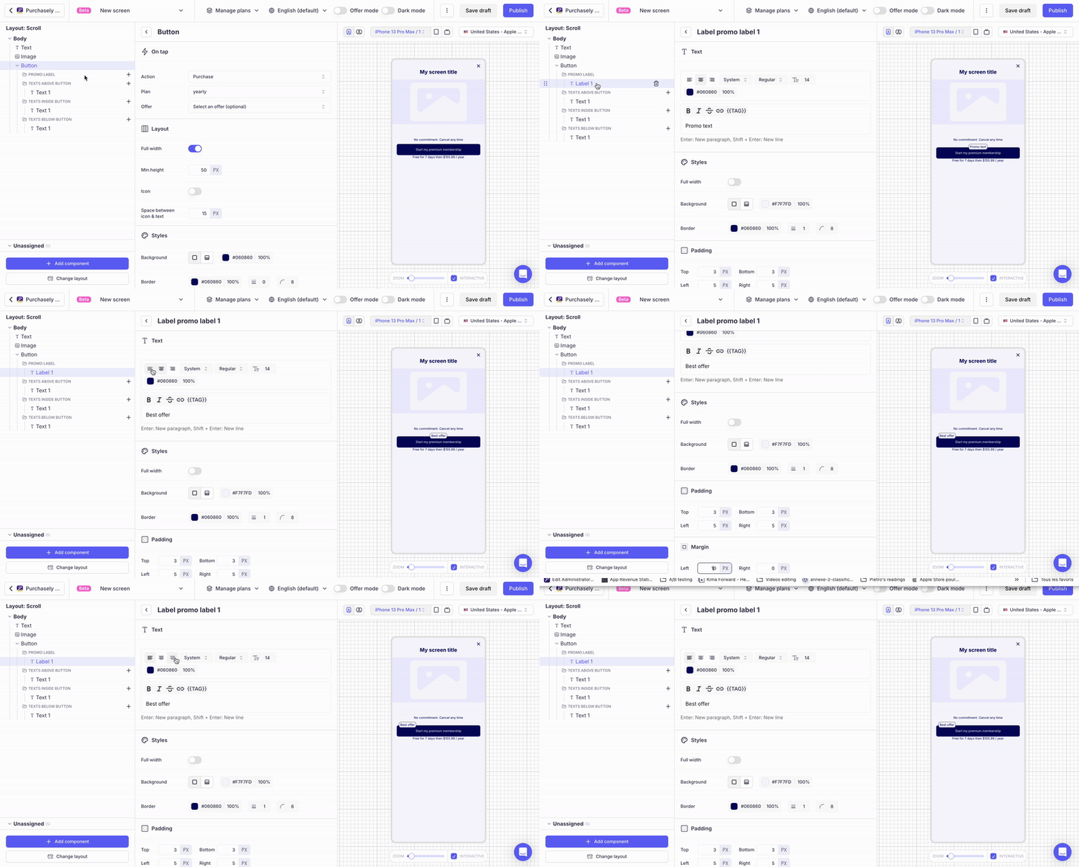
You can display a Promo overlay on any button / picker or CTA. A promo overlay is a Text with a background and a border. You can adjust its horizontal positioning by using changing the text alignement (left / center / right) and adjusting the left & right margin
Updated 6 months ago