

Configuring a Screen with the Screen Composer
This section provides a complete overview of the Screen Composer
General overview
Purchasely Screen Composer provides an intuitive and flexible way to design custom screens for your app.
The module integrates a comprehensive library of pre-built components, that users can simply drag and drop into their screen structure and organize in different layouts to best fit their needs.
Screens can be created either from a white slate or from a pre-configured template that can be customized as desired, and on which components can be added / removed or reordered.
Once components are placed, they can be easily reordered and individually configured to match the desired design and branding. The layout can be adjusted at any time, providing full flexibility to adapt your design as your needs evolve. This ensures a seamless and dynamic experience in creating personalized app screens.
Retro-compatibility considerations and fallback Screen for old versions of the SDKThe Screen composer requires the version 5.0.0 of the Purchasely SDK and above.
This can be a problem as long as old versions of the app, integrating previous versions of the SDK (< 5.0.0) are in the air.
Be reassured, when creating a new Screen with the Screen composer, you can select a "legacy Screen" (built with the legacy Paywall Builder) and associate it with the new Screen.
Click on the dropdown containing the Screen name is the top bar, then select the fallback presentation / Screen to associate with this new Screen
If an old version of the SDK (< 5.0.0) tries to fetch the new Screen (built from the Screen composer) from a Placement, the fallback screen, compatible with the old version of the SDK, will be retrieved instead.
Running A/B tests with new ScreenYou can include new Screens built with the Screen composer in A/B tests. In this case, old version of the SDK (5.0.0) will fallback on the legacy Screen associated to the new one and be excluded from the A/B test.
If you run an A/B test between a legacy Screen and a new Screen, bare in mind that the balance (e.g.: 5°0-50 split) between the two variants might be affected by this fallback and exclusion rule: as old SDKs cannot display the new Screen and are therefore excluded from the A/B test, the new Screen variant is likely to have less unique viewers.
Is this possible to migrate legacy Screen in the new Screen composer?Unfortunately it is not possible to edit your old Screens and Paywalls built with the legacy Screen Builder in the new Screen Composer. You will have to replicate them.
Product Tour
General process for creating a Screen
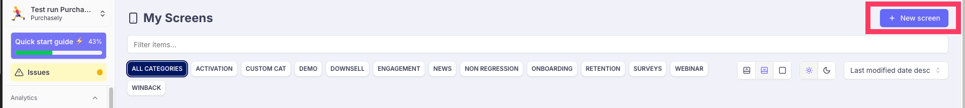
The Screen Composer can be accessed by clicking on the button + Composer in the Screens section of your Purchasely Console
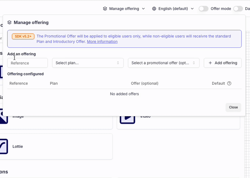
1. Paywalls only: define the Offerings
If the Screen configured is a Paywall or Subscription Landing Page, start by defining which Offerings available on the Screen.
An Offering includes:
reference: a unique identifier (letters, numbers, _ or -)Plan: choose one from the Plans configured in the Purchasely Console- (Optional)
Promotional Offer: choose one from the Promotional Offers configured in the Purchasely Console
Wrapping an Introductory Offer and a Promotional Offer in one unified Paywall
With Offerings, you can wrap an Introductory Offer and fallback on a Promotional Offer in one unified Paywall setup:
-
The Offering is linked to a Plan that includes a Free Trial (via Intro Offer) and an Promotional Offer that mirrors it.
-
The SDK will automatically evaluate and apply the appropriate offer:
➕ If the user is eligible for the Intro Offer, it is applied.
➖ If the user is not eligible, the Promotional Offer will be applied instead.
Default Offering
One of the Offerings must be defined as the default one.
- For components which are not specifically mapped with a Plan (like a carousel, or a bulleted list), if Tags are used within the associated Text elements, the SDK will compute the Introductory Offer eligibility based on the default Plan.:
- It will display the Offer text if the user is eligible to the Introductory Offer of the default Plan, and the Regular Offer otherwise.
2. Choose the layout
Select the desired layout among the ones available
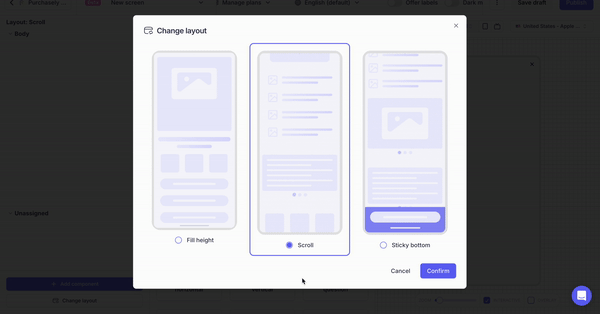
See Layouts for more details
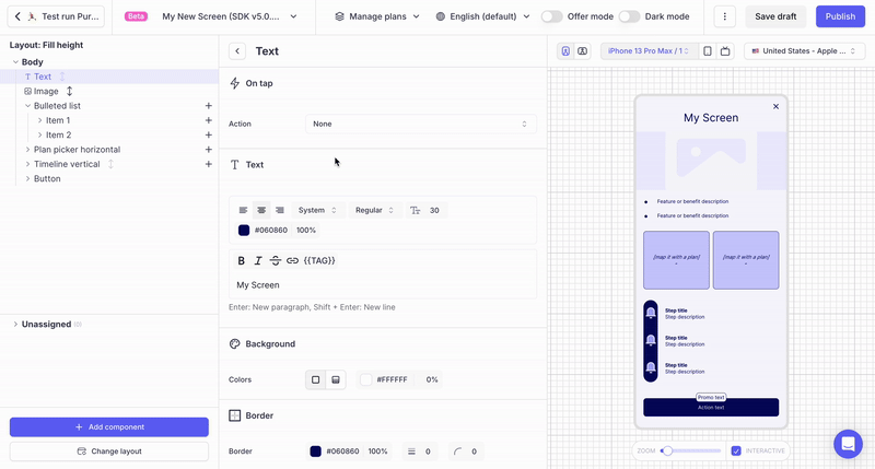
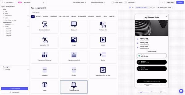
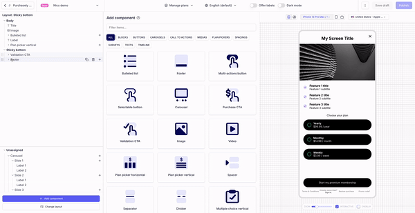
3. Select the components
Add the desired components by clicking on the button "Add components" and drag & dropping the component in the Screen structure and reorder them the way you want
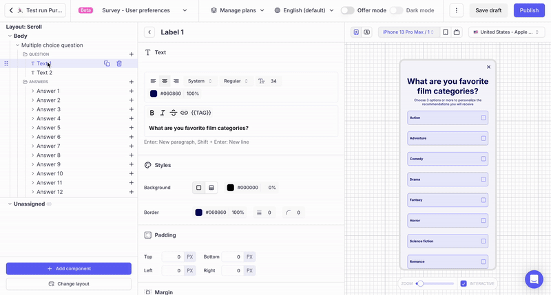
4. Configure each component
Configure each component individually and integrate your copy, contents and branding (including custom fonts)
5. Configure your Screen in dark mode (optional)
Each color (font, border, background etc...), image, video or animation can be set for dark mode
6. Localize your Screen (if necessary)
Localize every text of your Screen
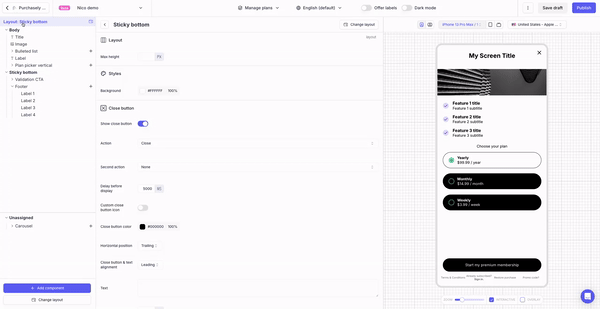
7. Configure the Close button look and feel and behavior
Close button configuration details are provided here
Then hit Publish and you're all set!
Layouts
Layouts define the way the Purchasely SDK will organise and display the components on the device screen.
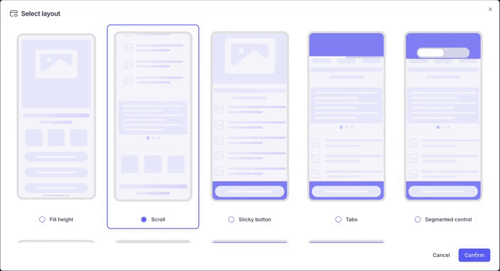
9 layouts are available (and we keep adding more):
| Layout | How it works | Best for |
|---|---|---|
| Fill height | Not scrollable — every component must fit the screen; the SDK expands (or shrinks) one component to fill it (right-click → "Expand to fill") | Screens that fit a single viewport |
| Fill height multi-groups | Same fit/expand rules, with components organised in several groups | Survey screens |
| Scroll | Stacks components from the top; no expansion; scrolls when content exceeds the screen | Standard content |
| Scroll multi-group | Same as Scroll, with components organised in several groups | Survey screens |
| Sticky button | Two surfaces: a scrollable Body and a Bottom bar that stays sticky | Long paywalls keeping the CTA always visible |
| Tabs | Components split across tabs/sections | Comparing multi-tier subscription offers |
| Segmented controls | Like Tabs, but with horizontal segmented controls | Compact switching between tiers |
| Carousel | Up to 20 slides; the component can be expanded (right-click → "Expand to fill") | Onboarding, surveys, quizzes |
| Switch | Works with the Switch component: enable free trials, offer Android instalments, or save user preferences via custom attributes (opt-ins, privacy, T&C) | Boosting conversion with toggles |
Surfaces
A layout is composed of 1 or several surfaces which are displayed in Bold in the Screen structure.
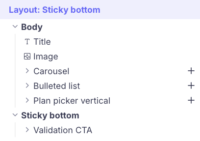
Components can be dragged and dropped in the surfaces and reassigned from one surface to another one. Within a surface they can be reordered.
Components that haven't been assigned to any surface can be found in the Unassigned folder.
You can change the layout even after configuring the components, and reassign them to the different surfaces available in the new layout.
When changing layout, all the components are put in the Unassigned folder and you must reassign them one by one to the surfaces of the new.
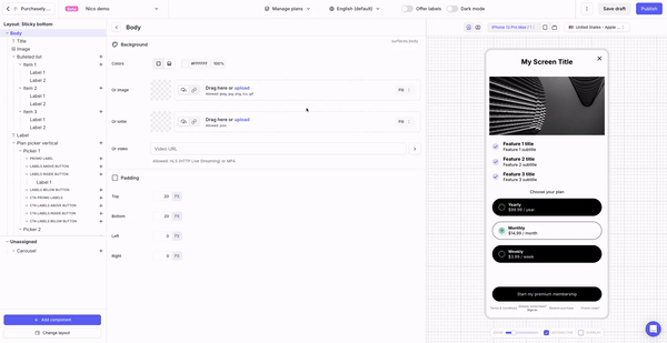
By clicking on a surface, you can change its properties, such as its background and the padding
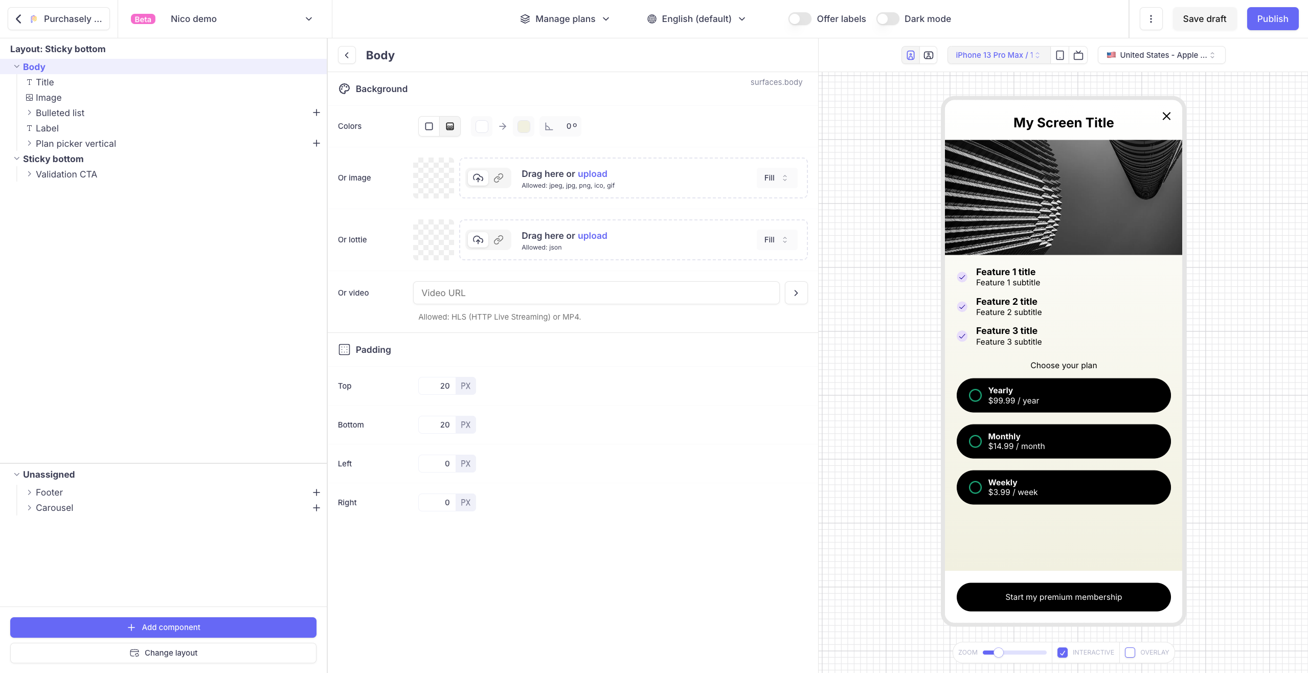
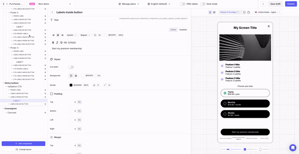
Padding and margin
Padding and margin can now be adjusted with the Screen Composer. It provides you with much more flexibility to tailor your design as you desire.
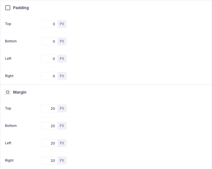
- Padding is the space inside a component, between its content and its border. It adds space around the content within the element. It can be defined for surfaces and components.
- Margin is the space outside a component, separating it from other elements. It adds space between the component's border and the surrounding elements. It can be defined only for components.
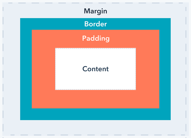
Both padding and margin control spacing but in different contexts: padding is inside, margin is outside.
Library of components
The Screen Composer features a comprehensive list of components which can be customized in many different ways. Here is the list of components available (and we will continue adding new ones regularly):
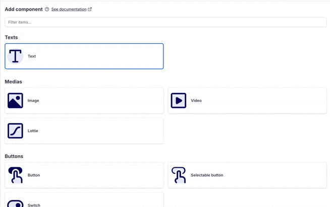
Here are the capabilities offered by each Component
- Texts
- Carousel
- Images
- Videos
- Buttons
- Plan pickers vertical
- Plan pickers horizontal
- CTAs for Plan pickers
- Multiple Choice Questions
- CTAs for Multiple Choice Questions
- Bulleted list
- Timeline vertical
- Footers
- Countdowns
- FAQ
- Reviews
- Table comparison
- Spacers - Separators - Dividers
- Vertical Stack
Various features associated with the Screen composer
Defining offer specific copy with the Offer mode
Adapting Screens to different devices
Previewing your Screen on the device
Updated 6 days ago