Texts
This pages provides details on the capabilities of Texts in the Screen Composer
Texts can be used inside a Screen. They can be either:
-
associated directly to the screen as standalone elements
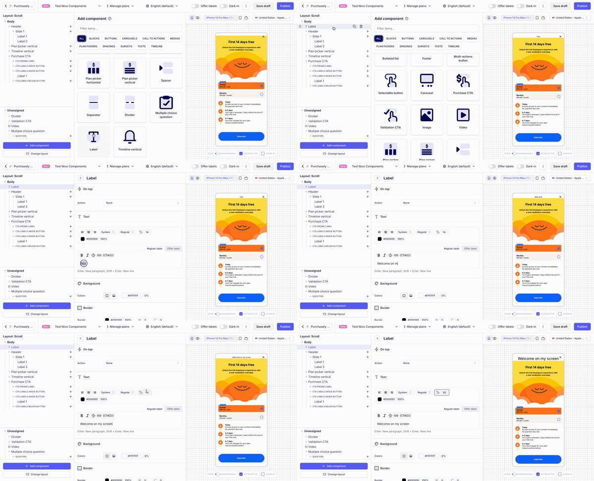
-
or added as sub-elements of a component by clicking on the + button in the structure of the component
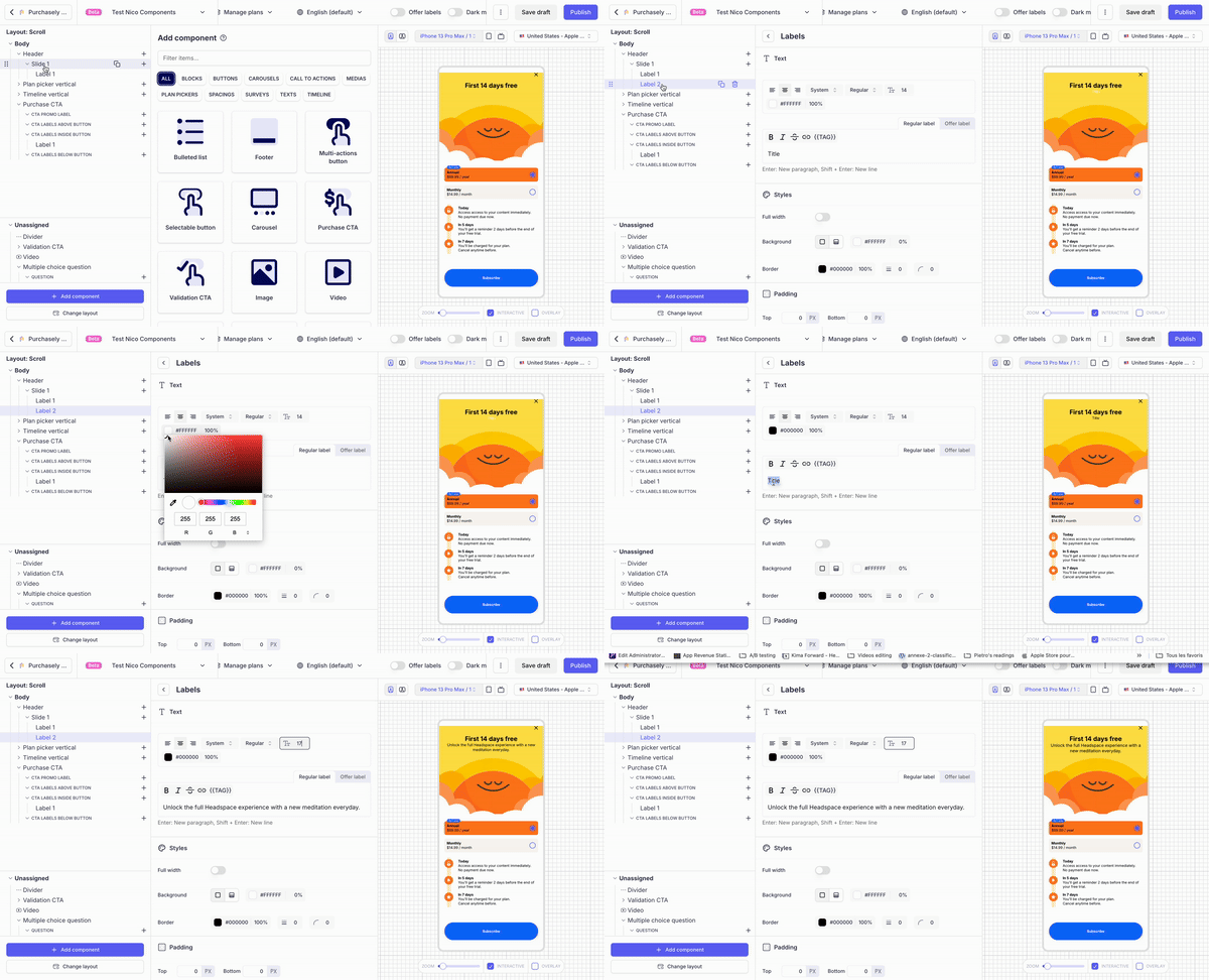
Text properties
A Text has the following properties:
- it is associated with one unique text alignement (left, centered, right) and font style (font-family, font weight, size, font color)
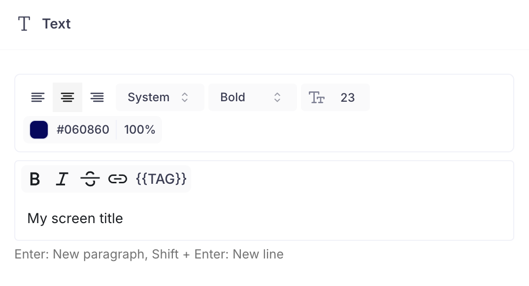
- It can be multi-line.
- Press
Enterto add a new paragraph (2 new lines) - or
Shift + Enterto add one single new line
- Press
- Within a Text, different text decorations can be applied (Bold, Italic,
Strike-through) and links can be inserted (web URL or deeplink) - It is also possible to add Tags. If no plan is associated to the Tag, it will refer to the default Plan defined for the Screen
If you need to apply 2 different font styles, then you should insert 2 different Texts and apply a specific font style to each.
Defining different styles depending on the state of the parent component
Some components (such as the Plans pickers and the MCQ) have a state and can be either Selected or Unselected. For them, 2 different style can be associated to the the Text. Depending on the state of the Text's parent component (whether it's selected or not), the SDK will apply the appropriate style.
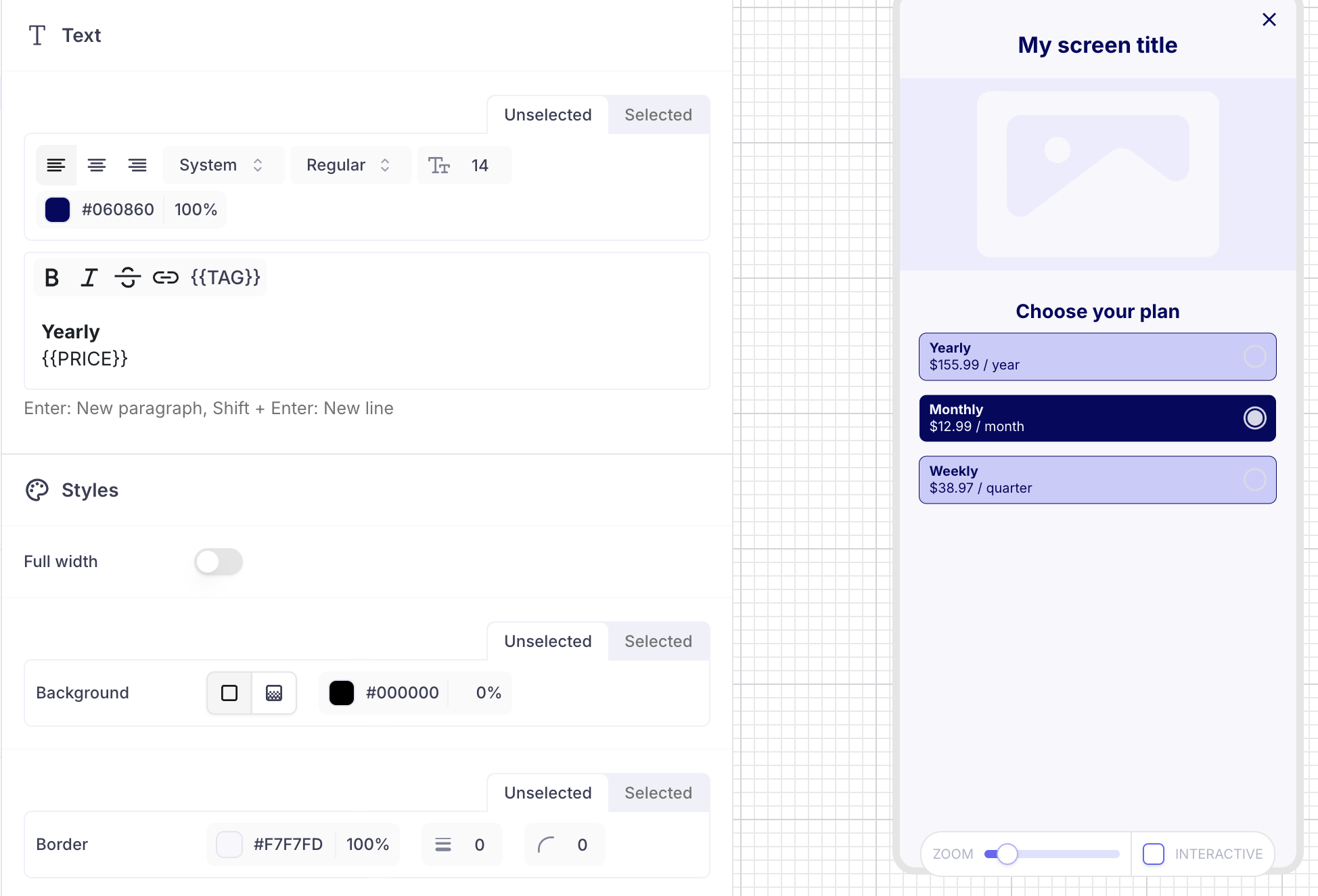
Style applied to the Text when the parent picker is unselected
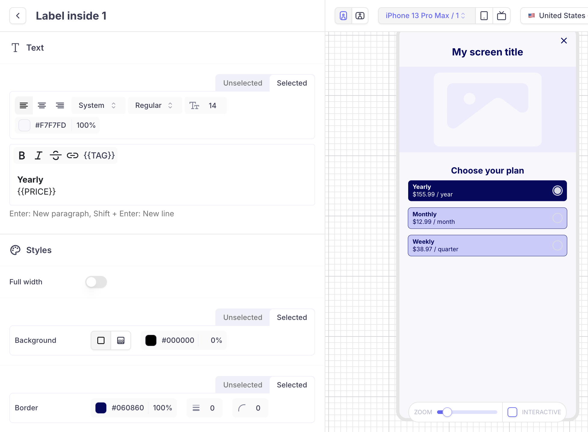
Style applied to the Text when the parent picker is selected
The same principle applies for Call To Actions, that can be Active or Disabled.

Regular text vs Offer text
This features allows you to display alternative texts (called Offer text) anywhere in the Screen that depends on the eligibility of the user to an Offer 🤩
By default the value displayed is the Regular text. If you want to override it with a specific text referring to the Introductory Offer, you must activate the Offer Mode
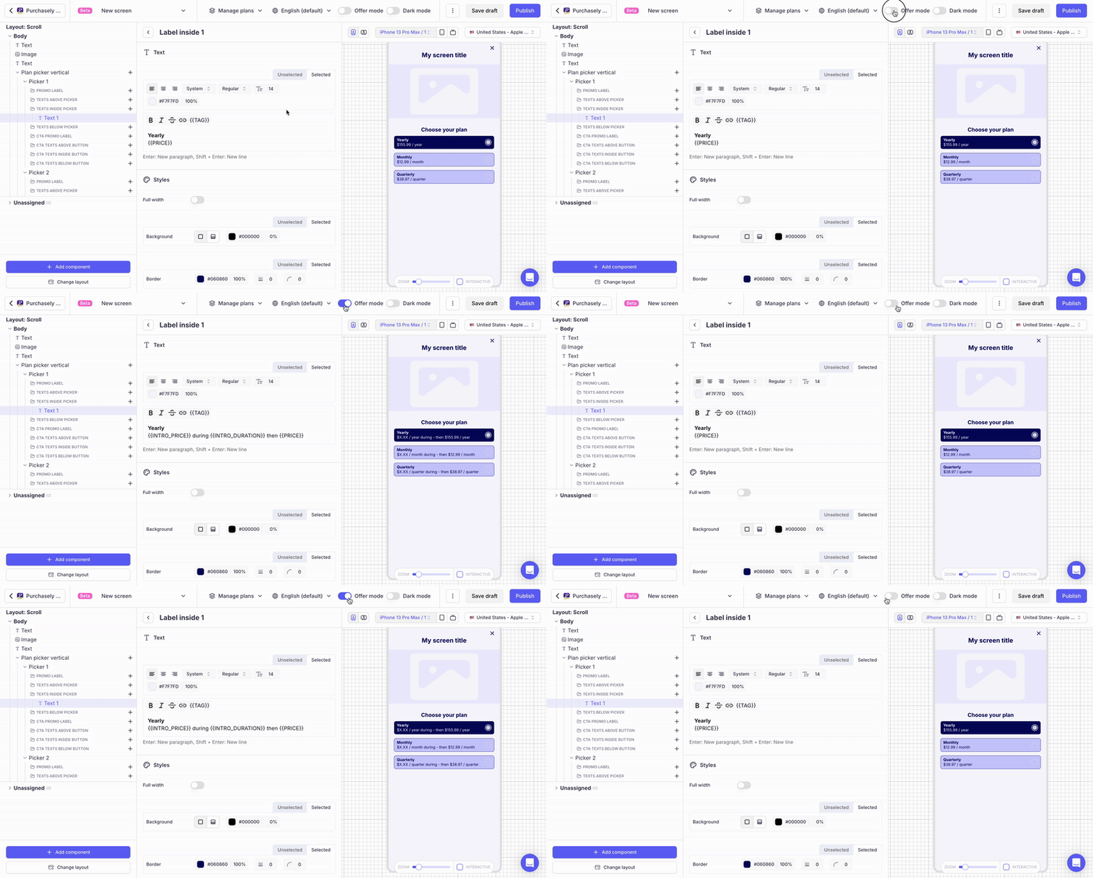
The SDK business rules for displaying the Regular text or Offer text are the following:
- the alternative Offer text will be displayed instead of the Regular text, if an Introductory Offer has been set for the Plan AND if the user is eligible to the Introductory Offer
- The Plan taken into consideration is either the one directly mapped with the parent element (eg: for a button or a Plan picker), or the default Plan
- The Regular text will be displayed if one of the following conditions is met:
- if no Introductory Offer has been associated to the Plan
or - if the user is not eligible to the Introductory Offer,
or - if no Offer text has been set
- if no Introductory Offer has been associated to the Plan
Displaying the Text inside a cartridge
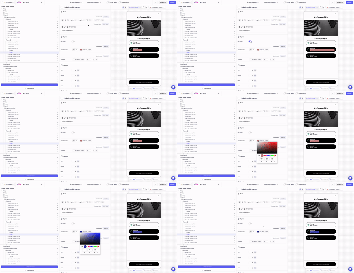
Texts can be displayed inside a cartridge. You can set the background and border and adjust the padding (by default their opacity is 0%)
By switching ON the Full width toggle, you can make the cartridge fill all the space available horizontally.
Associating an action to a Text
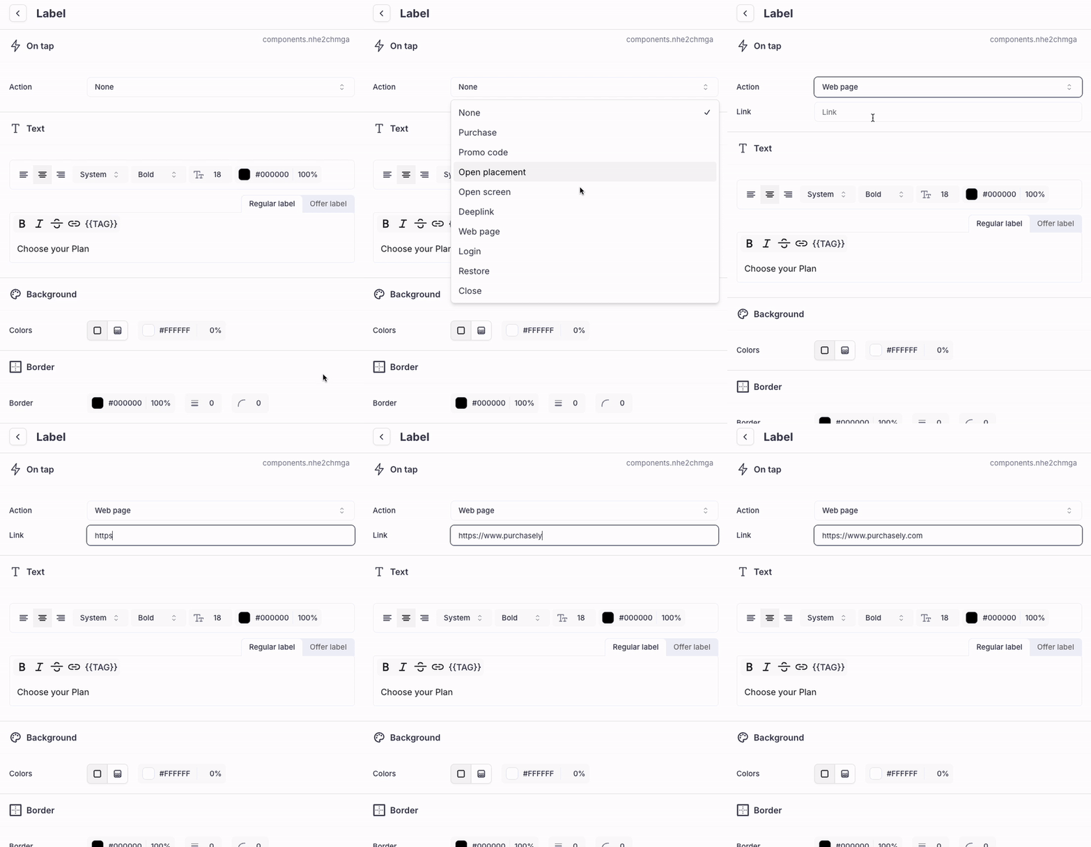
Texts as a stand-alone component can be associated to an action, that will be triggered when users tap on it.
You can define any action among the one listed below.
-
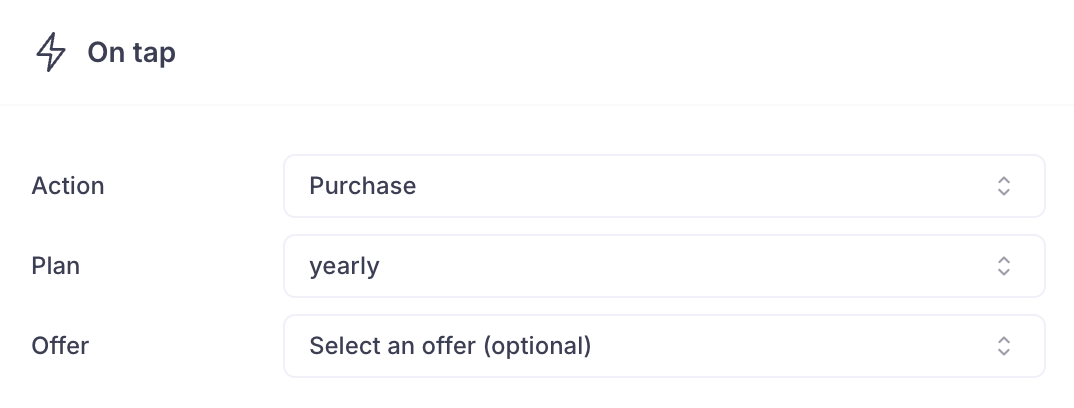
Purchase: a tap on the button will trigger an In-App Purchase Flow.-
The Plan (and optionally the Promotional Offer) can be associated directly to the button
-
-
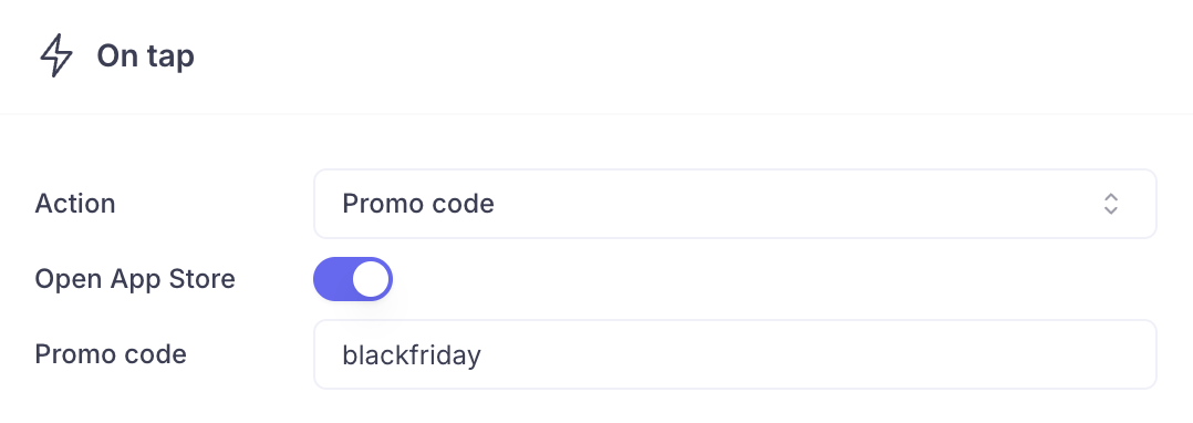
Promo code: a tap on the button will trigger the Promo code redemption flow.-
On iOS, the promo-code can be redeemed in the app: in this case the user has to enter the promo code manually (which means that you should display it on the Screen itself)

-
Or inside the App Store: in this case you must enter the associated promo code. The user will be redirected in the App Store to redeem it and the promo code will be pre-filled.
-
-
Open placement: a tap on the button will open the associated Placement
-
Open Screen: a tap on the button will open the associated Screen
-
Deeplink: a tap on the button will open the associated deeplink
-
Web page: a tap on the button will open the associated web page in the web browser
-
Login: a tap on the button will handover the control to the app (using the Paywall action interceptor) and provide the value "Login", so that the app can display the sign-in form
-
Restore: a tap on the button will trigger the restore purchases action
-
Close: a tap on the button will close the current Screen
-
Close all: a tap on the button will close the current Screen and all the Purchasely Screens previously opened
Overriding the Texts of the CTA
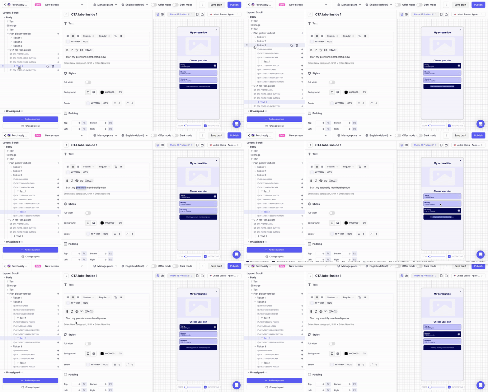
In the Plan Picker, the collections starting with CTA allow to override the Texts of the CTA depending on which picker is currently selected:
- When the Picker will be selected by the user, the Texts in these collections will override the default Texts associated at the Purchase CTA level.
- Overriding the Texts is optional but if you override one of them, you must override them all.
Example:
-
The default Text defined for the CTA is "Start my premium membership"
-
This Text is overridden for each picker:
-
"Start my weekly membership" for the Picker associated to the Weekly Plan
-
"Start my monthly membership" for the Picker associated to the Monthly Plan
-
"Start my yearly membership" for the Picker associated to the Yearly Plan
-
-
When a Picker is selected, the Text inside the CTA changes to match the value defined at the picker level
Updated 6 months ago