

Adapting Screens to devices
This section provides details on how to adapt Screens for different screen sizes, devices, and orientations
Your users are accessing content on a variety of devices with different screen sizes and form factors, including smartphones, tablets, and TVs. To enhance user experience, your Screens need to adapt seamlessly to these variations.
Purchasely Screen Composer allows you to preview and perfect your designs on any device type, ensuring optimal appearance and functionality. You can even preview screens on your own device using the QR code.
Purchasely offers several features to ensure your paywalls look great across all devices:
- Device-specific layouts — choose a different layout structure per device (Smartphone, Tablet, TV)
- Orientation-specific layouts — use a different layout for Portrait and Landscape on the same device
- Per-device component customization — show, hide, or rearrange components differently for each device
- Customizable sizes — override font sizes, spacers, and component dimensions per device
- Device-specific media — use different images and videos per device
Device-specific layouts
By default, a Screen uses a single layout (e.g. "Sticky button") that applies to all devices and both orientations (portrait / landscape). You can add a dedicated layout for Tablet or TV to completely change the structure and components displayed on that device.
Adding a layout for another device
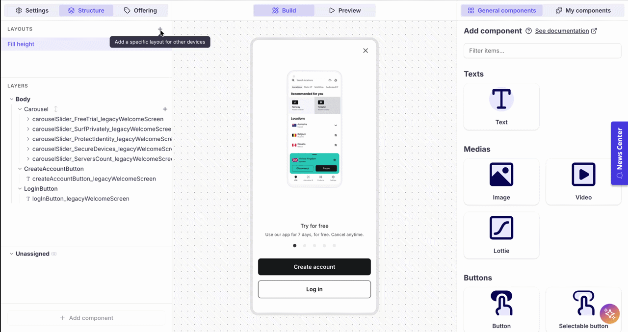
- In the Structure tab, click the "+" button next to LAYOUTS
- In the dialog, select the target device: Tablet or TV
- Choose how to start:
- Pick a layout — start with an empty layout template (Fill height, Scroll, Sticky button, Tabs, Segmented control, or Bring your own screen)
- Pick a layout with components — choose a layout template and copy all components from the default surface
- Copy from existing — duplicate an existing layout (e.g. copy your Smartphone Portrait layout as-is)
- Click Confirm
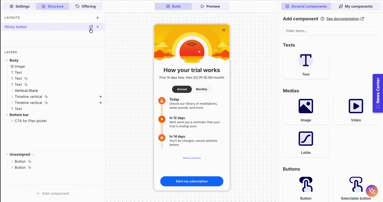
The new layout appears in the LAYOUTS panel. You can now select it to build and customize it independently from the other layouts.
Each device layout is fully independentWhen you select a device layout in the LAYOUTS panel, the layers, components, and preview all switch to that device. You can add, remove, or reorder components without affecting other device layouts.
Editing or removing a device layout
Hover over a device layout in the LAYOUTS panel to reveal the action buttons:
- Edit (pencil icon) — change the layout template for that device
- Delete (trash icon) — remove the device-specific layout entirely
- "+" — add a landscape orientation layout (see below)
Orientation-specific layouts
Within a device, you can also define a separate layout for Landscape orientation. This is useful when the wider aspect ratio calls for a different structure — for instance, using a Scroll layout in landscape instead of a Sticky button.
Adding a Landscape layout
- In the LAYOUTS panel, hover over the device you want to customize (e.g. Smartphone)
- Click the "+" button on the right — the tooltip reads "Add a specific layout for Landscape"
- Select a layout template for the Landscape orientation
Once added, the device entry expands to show both orientations:
Smartphone
  ↳ Portrait  - Sticky button
  ↳ Landscape - Scroll
Tablet - Scroll
Each orientation has its own set of components and can be customized independently.
Per-device component customization
Sometimes you don't need a completely different layout — you just want to adjust specific components for a given device. For example, you might want a shorter title on tablets, or hide a decorative image on TV.
To customize a component for a specific device layout:
- Duplicate the component — for example, duplicate "Title" to create "Title - Tablet"
- Customize the duplicate — adjust its content, styling, or properties as needed for the target device
- Assign it to the right layout — drag the original component to the Unassigned section in the device layout where you don't want it, and place the duplicate in its place
This way, each device layout displays the version of the component that is best suited for it, while the other version sits in Unassigned and is not rendered.
Unassigned componentsComponents in the Unassigned section are not displayed on the screen. Use this to keep alternate versions of components that are only relevant for certain device layouts.
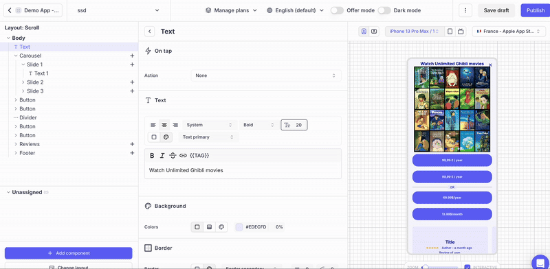
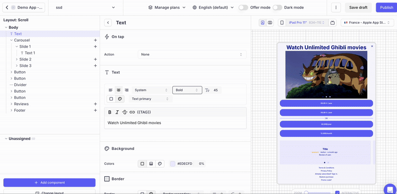
Customizable sizes by device
A 12pt font size may look perfect on a smartphone but not on a tablet or TV, where the screen is farther away. Purchasely lets you override font sizes and components' width, height, padding and margin for each device type directly on any design element.
Simply select the device type. The preview will automatically switch to the selected device, allowing you to override the size / width / height / padding / margin of the component for that particular device.
Device-specific media
Images and videos can also be customized per device. Purchasely allows you to set different images and videos for each device type in the same section where you customize sizes.
This is particularly useful when an image that looks great in portrait on a smartphone needs a wider crop or a completely different asset on a tablet or TV.
Device-specific display mode
You can also set a different display mode for each device type. This is configured in the Settings tab of the Screen, under Display modes. For example, you might want to display a Screen as a Modal on smartphones but as a Pop-in at 50% height on tablets.
Each device (Smartphone, Tablet, TV) has its own display mode setting that can be configured independently.
Display mode is per device, not per orientationUnlike layouts, the display mode cannot be customized per orientation (Portrait vs Landscape). It applies to the device regardless of orientation.