Footer
This section provides details on footer configuration in the screen composer
General Overview
In a paywall, a footer serves as a supportive section at the bottom of the page that provides useful information and resources to help users make decisions about subscribing This section often addresses common concerns, offers trust signals, and gives users easy access to important information without cluttering the main content of the paywall.
Benefits:
- Encouraging Account Creation and Engagement: Including a link for signing up for a free account or subscribing to a newsletter in the footer can provide a way for users to engage, potentially leading to future conversions.
- Navigation Support: A footer with links to popular pages or sections in your website can guide users back to the main site or other relevant content, making them more likely to consider a subscription after exploring further.
- Legal and Compliance Links: Many paywalls require clear terms and privacy policies to comply with the store and local laws (e.g., GDPR in the EU). Placing these links in the footer can ensure compliance while maintaining an uncluttered main paywall interface.
- Contact Information: Providing contact information like email support, chat options, or customer service phone numbers can address user questions, reducing hesitation to subscribe.
Examples
FAQ Link: They often include a prominent FAQ or “Why Subscribe?” link in the footer, addressing common concerns around subscriptions.
Link to Blog and Help Center: The footer might include links to Medium’s blog or Help Center, which offers explanations on subscription benefits and tips for using the platform.
Links to Privacy and Terms: The New York Times footer on its paywall page includes links to the Privacy Policy, Terms of Service, and information about cookie policies.
Configuration
The Footer Structure:

It is composed of:
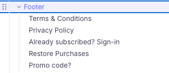
- Footer: actual element (highlighted on the picture above), where settings, general styles and layout parameters can be defined
- Texts / links: which is an individual element where you can fill in texts and links.
You can not add any icons to the links or texts.
Footer configuration process
To configure the Footer, here is the process:
- Make sure the Footer component is added to the Screen
- Add as many Texts/ links you require to display in your footer
- Don't forget to add URL to the links you have created
- Customize the Layout of the Footer component and adjust the padding and margin
Layout configuration:
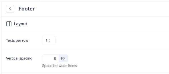
- Texts per row: You can set if you want to show number of texts/links per line you can choose from 1 upto 4 texts per row at a time.
- Vertical spacing: With this vertical spacing, you can determine the space between the texts/links it goes handy when you want to align more than 1 Texts per row.

Styles
- Background: You can change the background colour of the footer

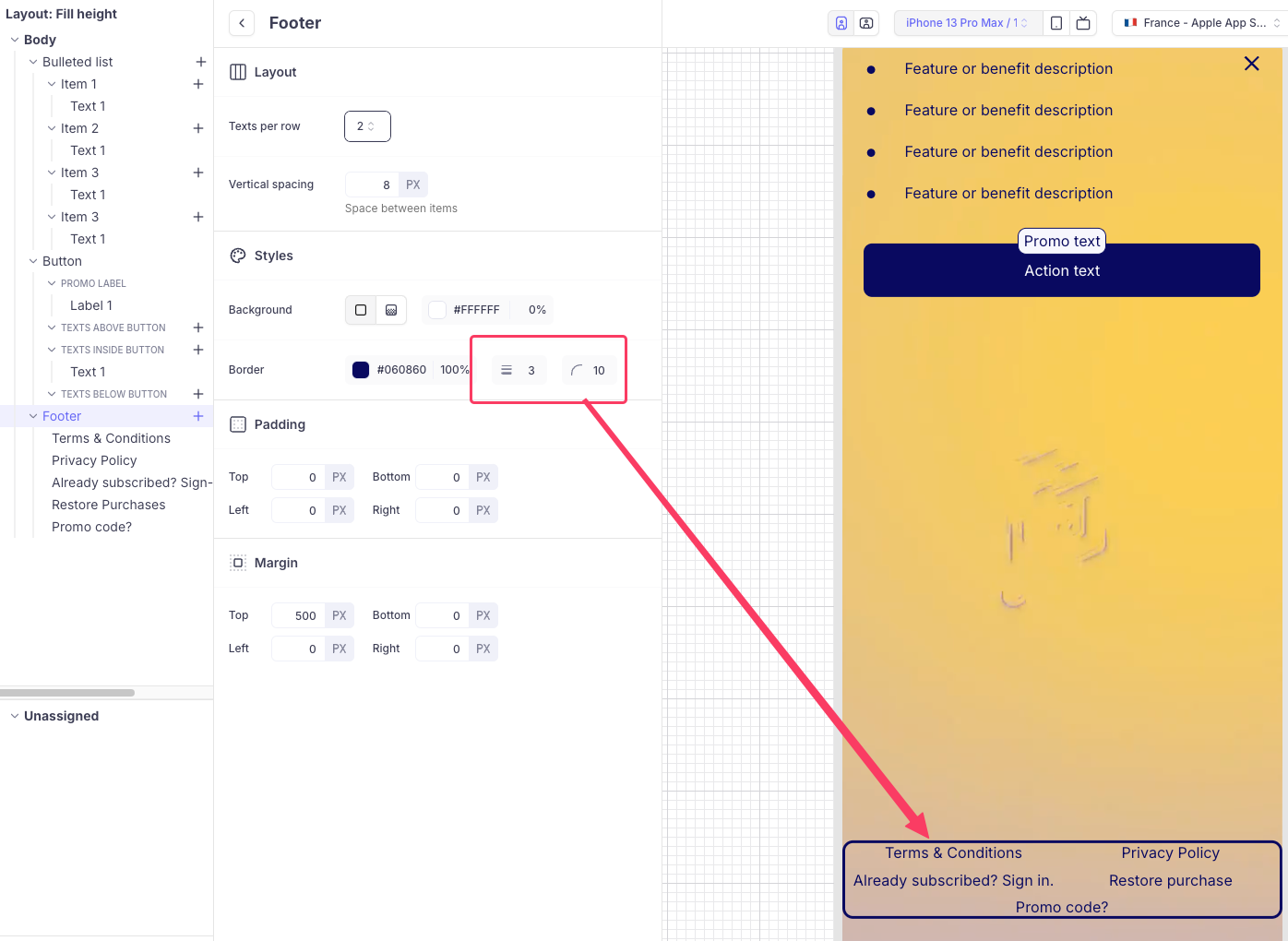
- Border: You can add a border around the footer texts and set corner radius too.

You also have an option to add margin and padding to the Footer component like you have for other elements.
Texts Configuration
Once you add a new Text to the footer and configure with following options.
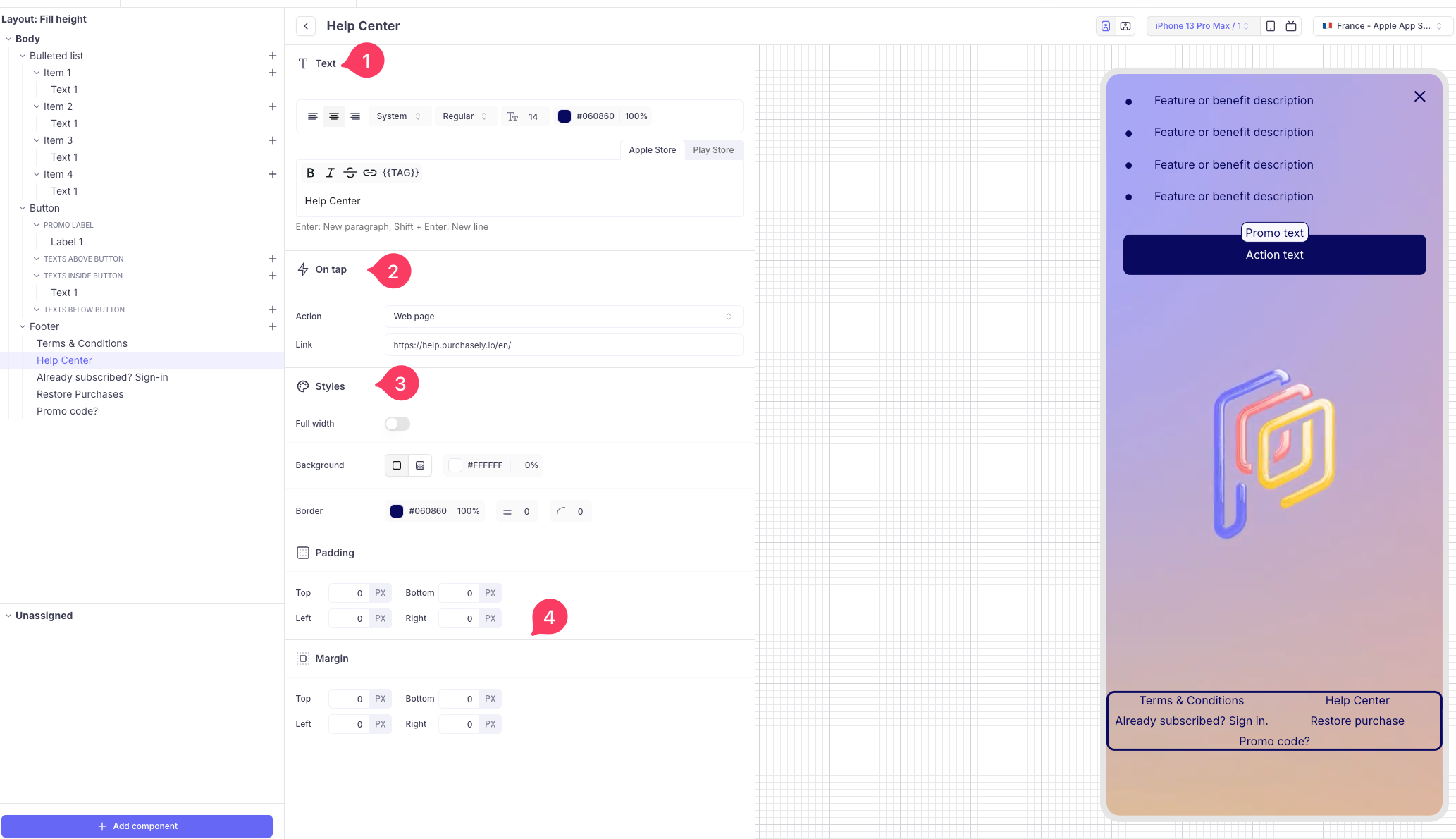
- Texts: You can align the text, change the font, font weight and colour in this section.
- On Tap: You can set what your text or link has to do when tapped or clicked. Here in this example, we chose Web page and added link to our Help centre.
- Styles: You can set the background colour and add a border and corner radius.
- Padding and Margin: Padding is the space between the content of an element and its border. Margin is the space outside the border of an element, pushing it away from surrounding elements.

Updated 6 months ago