Images
This section provides details on image configuration in the screen composer
General overview
Images exist as stand-alone components of the Screen Composer, or as parameters or other components or Screen Layout Surfaces
Image configuration
Uploading an image VS configuring an image URL
When configuring an image, you have 2 choices:
-
either you upload it by clicking on the upload link or drag and dropping the file in the appropriate zone

-
either you enter the public URL of the image by selecting the
🔗tab then entering URL of the image
If you use a public URL, make sure the infrastructure in charge of delivering the image is sufficiently robust.
To optimize loading time (which can impact significantly the Screen conversion), avoid using images which weight more than 1.5Mb to 2Mb
Image height
Image height can be defined in px.

With the layout Fill height, the image height can adapt depending on the Screen size. To indicate to the Composer that the image should "fill the remaining height", right click on it in the Screen structure, and select "expand to fill".
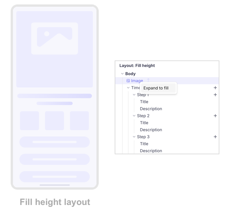
Expand to fill
- Without the expand to fill, the Screen layout looks like this:
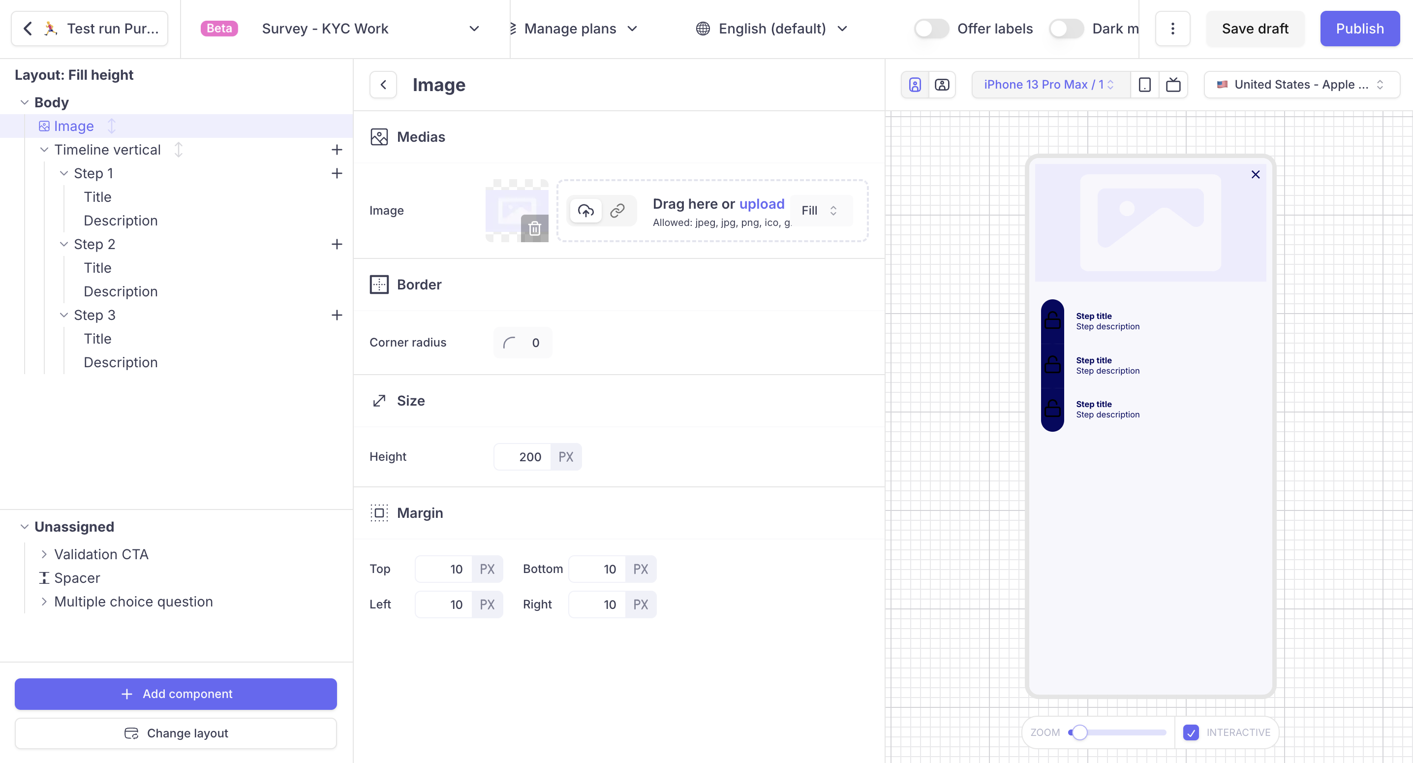
- With the expand to fill enabled, the Screen layout looks like this:
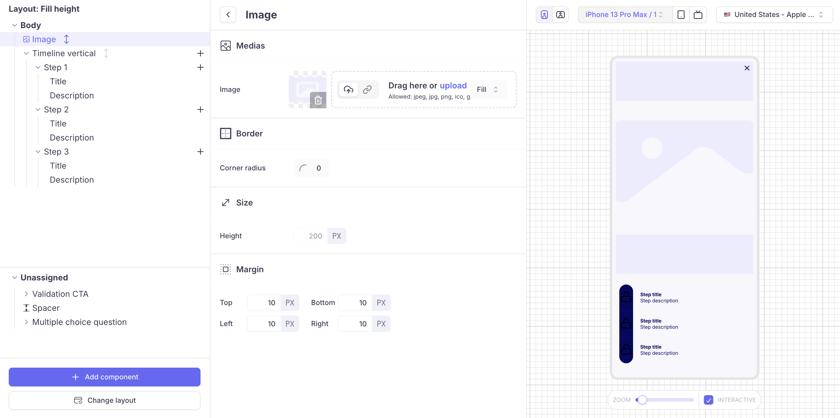
When expand to fill is enabled, the image height parameter is disabled
Fit vs Fill
The Fit mode and Fill mode for an image refer to how an image is adjusted within the component. You can modify it as follows:

-
In
Fitmode, the image is resized to ensure the entire image is visible, maintaining its aspect ratio without cropping. This may leave empty spaces around the image if the frame and image have different aspect ratios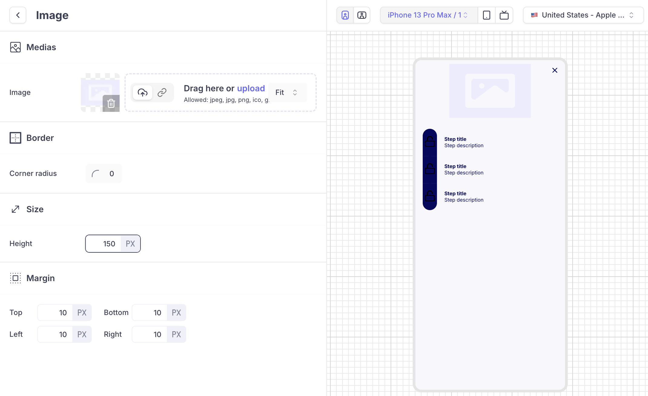
Image in
Fitmode: it is entirely visible. Depending on the ratio of the image and the size defined for the component it leaves empty space on the left & right of the image (pillar box) or on the bottom and top (letterbox)
-
In
Fillmode, the image gets resized and cropped as needed to cover the entire component without leaving empty spaces, which ensures the frame is fully covered but may cut off parts of the image, especially at the edges -
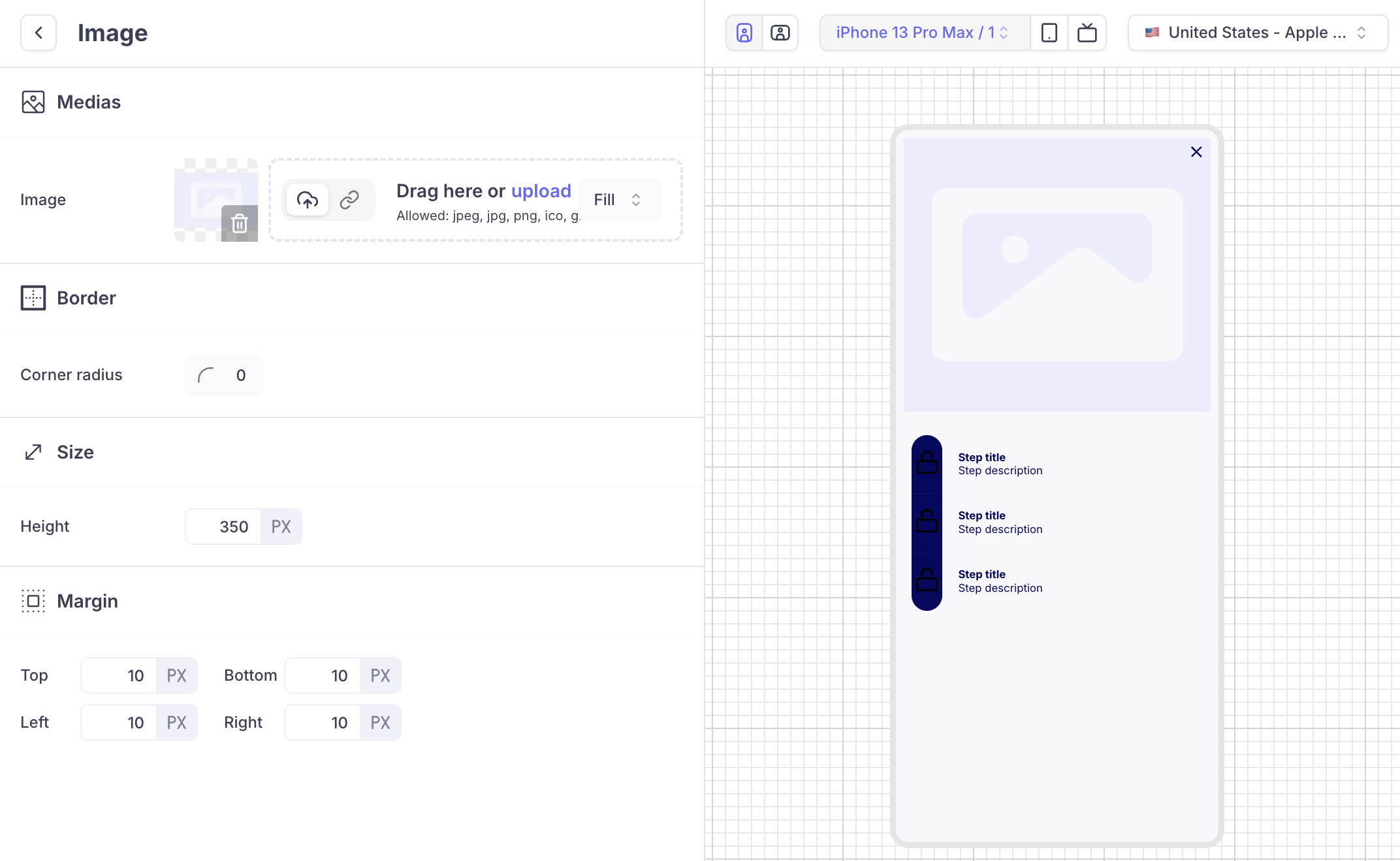
Image in Fill mode: it covers 100% of the component. Depending on the ratio of the image and size defined for the component, it will crop the image on the left and right side or on top and bottom.
Corner radius
The corner radius can be used to round the corner of the image
Margin
Margin is the space outside the image, separating it from other elements. It adds space between the image border and the surrounding elements or the screen edge.
Light mode vs dark mode
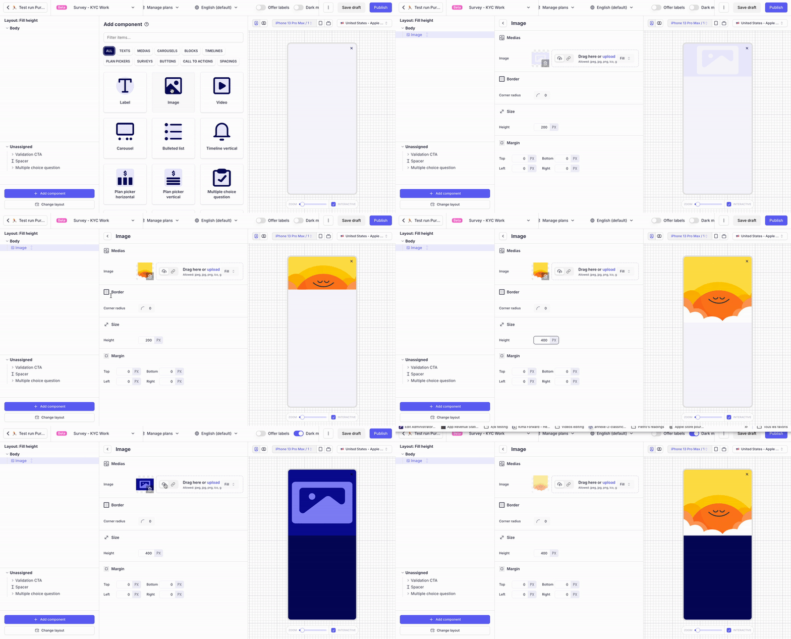
Images can be overridden for dark mode. By default, every image has a placeholder for light mode and dark mode.
When configuring dark mode (by activating the dark mode button), check that all the images added have been properly configured in dark mode too.
If you don't have a specific image for dark mode, then remove the dark placeholder image.
Select vs unselected
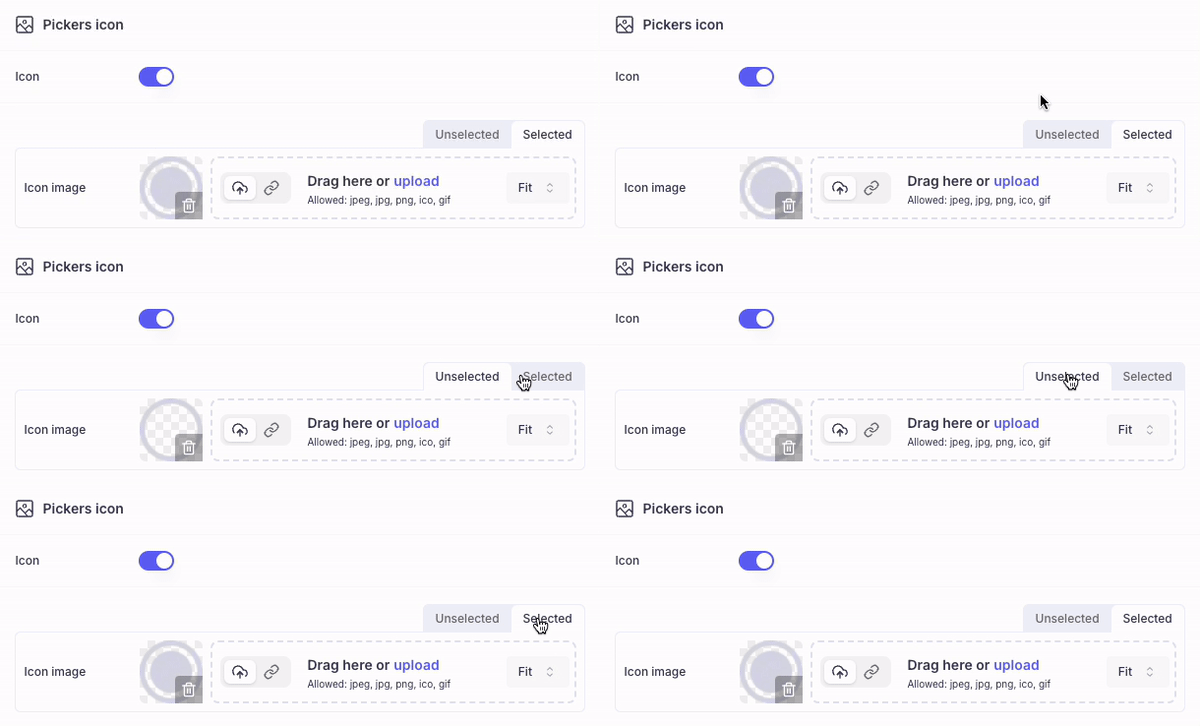
Some components (eg: pickers) have a state that can be : selected / unselected or active / disabled. In this case, 2 different images can be associated. The SDK will display the relevant image depending on the parent component state.
Background configuration for layout surfaces
It is also possible to use an image as a background of a surface. To do so, click on the surface and drag & drop (or upload) your image in the background section
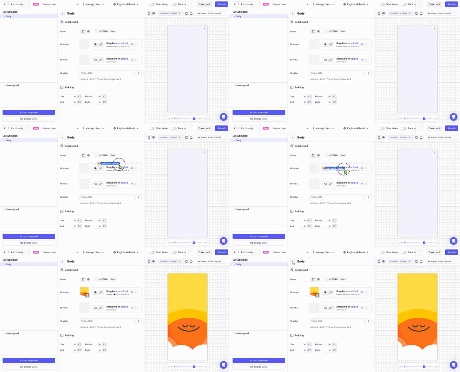
When used as a background images are fixed.
Updated 6 months ago