Timeline Vertical
This section provides details on Timeline vertical configuration in the screen composer
General Overview
A vertical timeline is a user-friendly design that presents the journey of unlocking features or progressing toward full access in a sequential manner.
Benefits of using Timeline Vertical:
- Encourages Engagement
Displaying the benefits in a sequential timeline motivates users to explore each feature.
Milestone indicators (e.g., "Trial Period," "Features Unlocked") make the process feel rewarding. - Increases Conversion
Users see what they’ll miss out on if they don’t upgrade.
The FOMO (Fear of Missing Out) effect works well here. - Mobile-Friendly Design
A vertical timeline is naturally scrollable and works seamlessly on mobile devices.
It aligns with modern user behaviors on smartphones and tablets. - Encourages Gradual Decision-Making
Users see smaller, digestible chunks of information rather than being overwhelmed by all features at once.
Encourages users to progress through the paywall experience at their own pace.
Configuration
Timeline Vertical

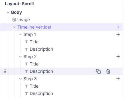
The component has 2 parts
- the parent Timeline vertical: It contains the configuration options for the overall timeline items.
- Steps: You can have as many steps as you want in a timeline vertical. The actual steps part lets you customize each and every step uniquely.
Timeline Vertical configuration
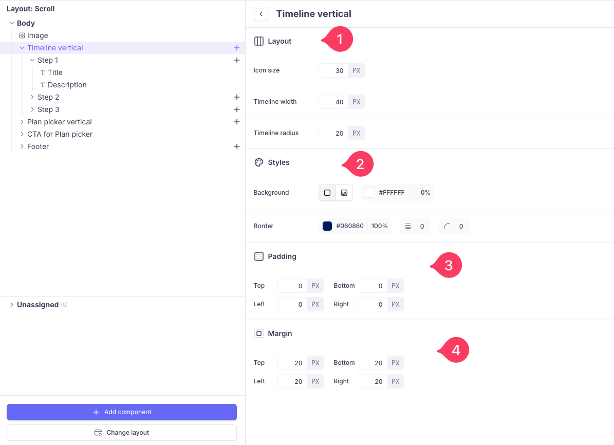
Once you have added Timeline Vertical configuration , you can configure them as follows:
- Layout: It lets you customize the size of the icon used in the timeline, width and radius of the timeline vertical
- Styles: You can add a background colour and border to the timeline vertical.
- & 4. Padding & Margin: Padding is the space between the content of timeline and its border. Margin is the space outside the border of an element, pushing it away from timeline.

Steps configuration
You can upload or provide URL to the icon and add background around the icon.

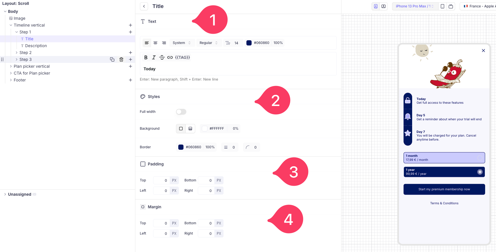
Title configuration
- Text: Add main text to the steps. You can add text to each and every steps you add. You can customize it with your own font, colour and size.
- Styles: You can add a background colour and border to the steps text.
- Padding: Padding is the space between the content of the steps text and its border.
- Margin: Margin is the space outside the border of an element, pushing it away from surrounding the steps text.

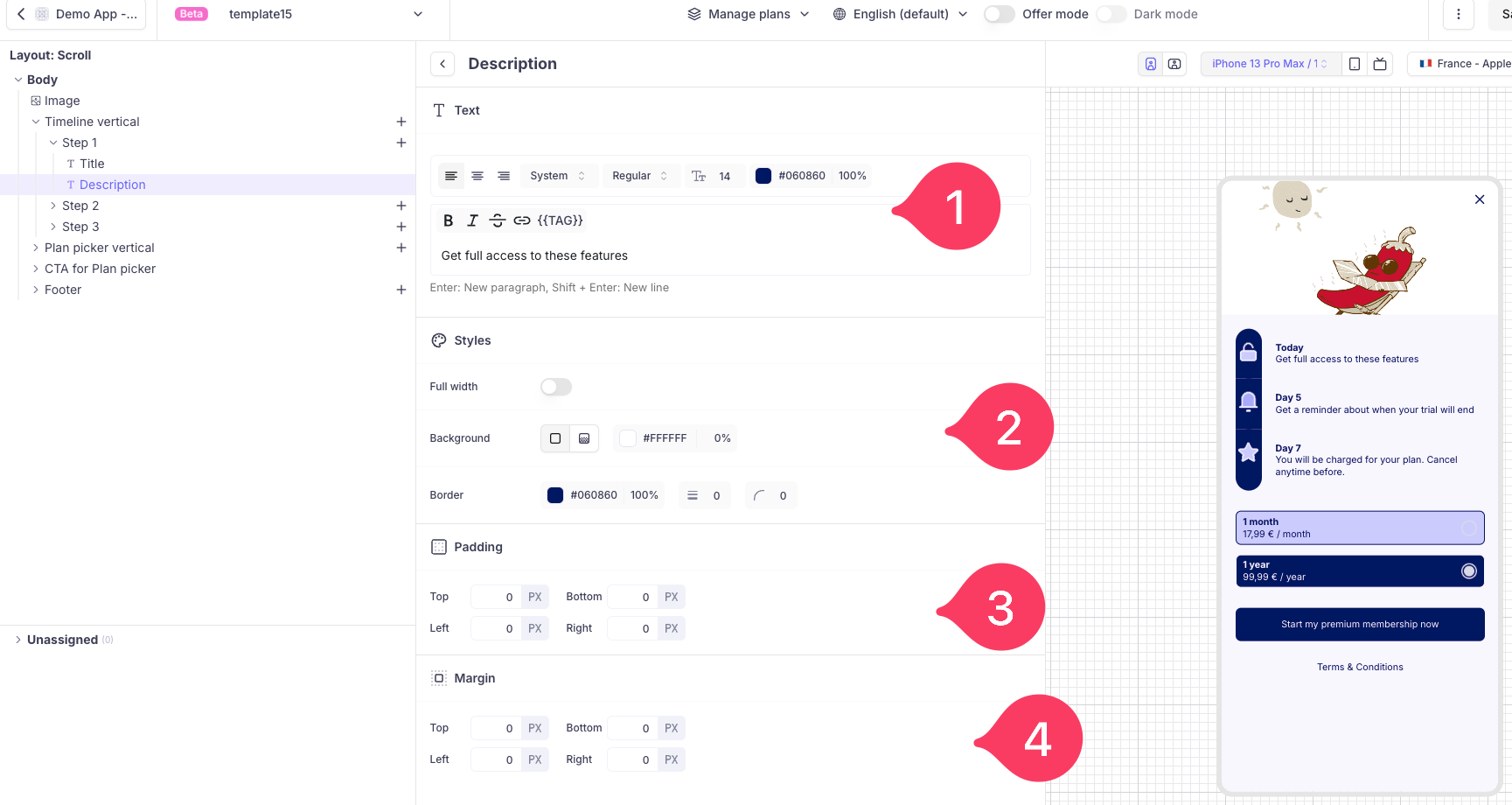
Description configuration:
- Text: Add subtitle or description text to the steps. You can add description to each and every steps you add. You can customize it with your own font, colour and size.
- Styles: You can add a background colour and border to the steps description.
- Padding: Padding is the space between the content of the steps description and its border.
- Margin: Margin is the space outside the border of an element, pushing it away from surrounding the steps description.

Updated 6 months ago