Plan pickers horizontal
This page provides details on the configuration of Plan pickers horizontal in the screen composer
General overview
A Plan Picker is a paywall component that allows users to view and select subscription Plans or one-time purchase options. User can choose which Plan they want to purchase and confirm it by clicking on the purchase CTA.
In the Screen Composer, the purchase CTA is a separated component from the Plan picker, called CTA for Plan pickers that can be put in a different surface:
- Plan pickers allow user to choose which plan they are interested in
- CTAs for Plan pickers are required to trigger the purchase action of the selected Plan
Configuration
Plan picker structure
The Plan picker horizontal has the following structure:
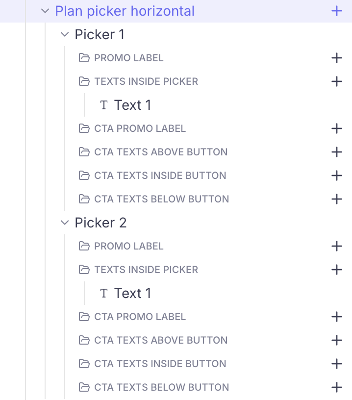
The component is composed of:
- a parent element (highlighted on the picture above), where general configuration options valid for all the pickers can be defined
- child elements that represent each Picker individually (Picker 1 & Picker 2 on the picture above). They are stacked horizontally and can be reordered.
Configuring the general parameters of the component
Here are all the parameters that can be adjusted for the Plan picker:
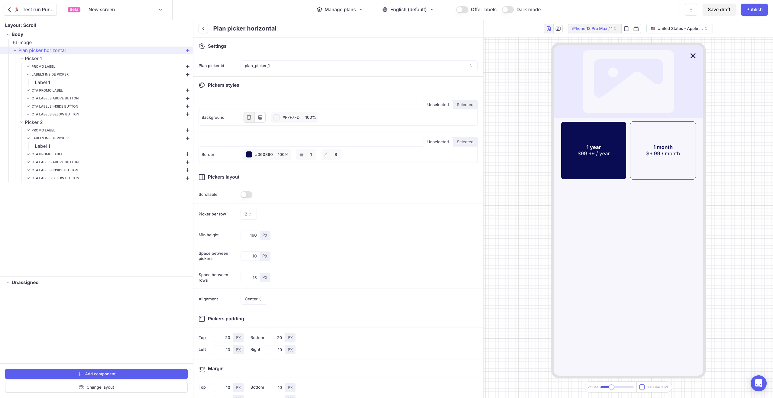
Plan picker id: the default value "plan_picker_1" works fine. Only change it if you want to have several Plan pickers on the same Screen:- Pickers on a same Screen which are are mapped with the same
Plan picker idinteract together. - Plan pickers with different
Plan picker idsare independent.
- Pickers on a same Screen which are are mapped with the same
-
Picker styles
-
You can define 2 different
backgroundandborderfor each picker depending on its state:unselected/selected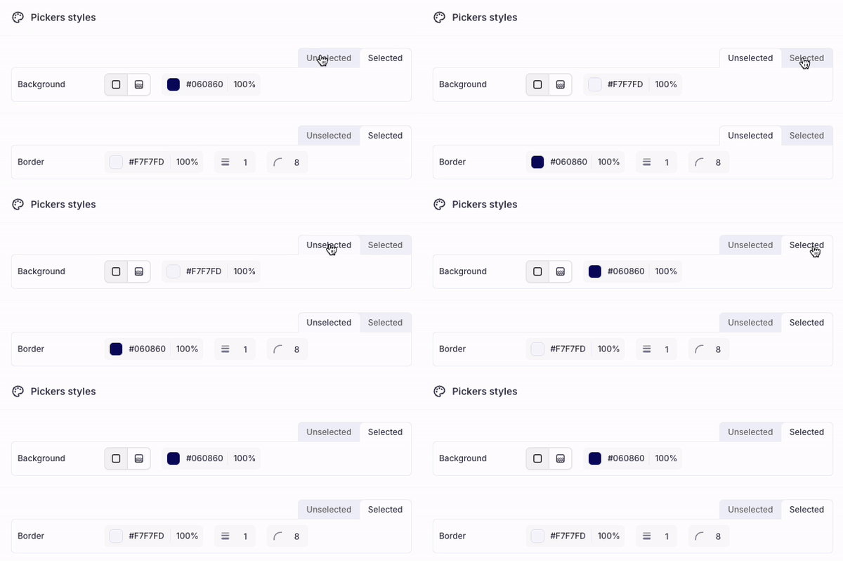
-
-
Pickers layout
-
Scrollable: If you want the picker to be scrollable horizontally and overflow from the Screen, you can enable this switch. In this case, you will need to define theWidthfor the pickers
-
Pickers per row: you can define the number of pickers per row. If the number of pickers is superior to the number of pickers per row, a new row of pickers will be created below.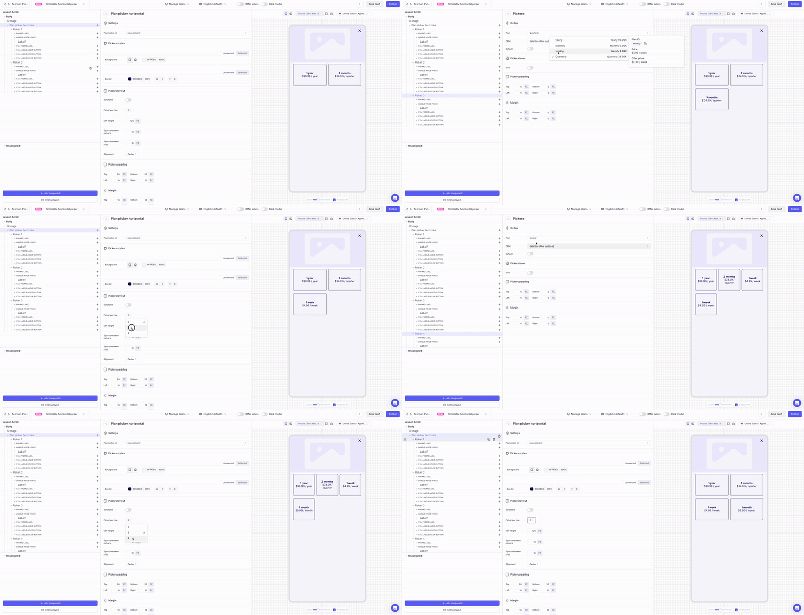
-
Space between pickersandSpace between rows: allow you to define the general layout of the component -
Min height: defines the minimum height of the picker. If the text overflows (eg: on devices on which the OS Accessibility feature has been enable), the picker will be automatically enlarged. -
Alignment: allows you to define whether the text should be vertically centered inside each picker or if the text should be vertically aligned on top.
-
- Pickers padding: As usual, you can adjust the spacing between the pickers borders and the contents (Texts) inside the picker.
- Margin: This allows you to define the spacing between the outside border of the whole component and the other components (top & bottom) or the edges (left and right) of the surface.
Configuring the pickers
Each picker must be associated with a Plan and can be optionally associated to an Offer (Promotional Offer). You must have associated the Plans to the Screen (Manage Plan section) prior to mapping it with the pickers.
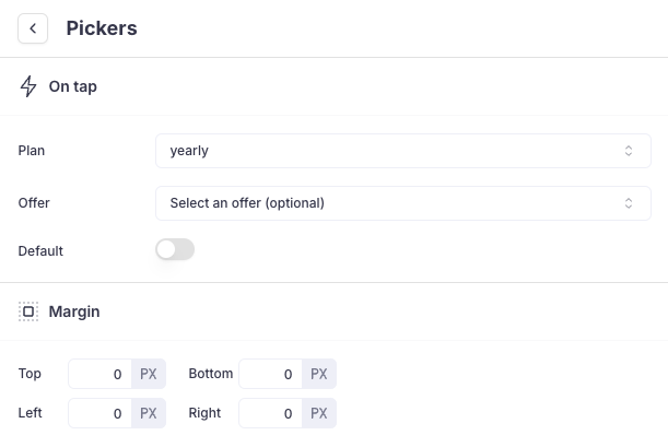
The Default switch allows you define that one Picker should be selected by default when the Screen is displayed (without need for the User to manually select it). Only one picker can be selected by default.
Margin Top / Bottom / Left & Right can be defined specifically for each picker.
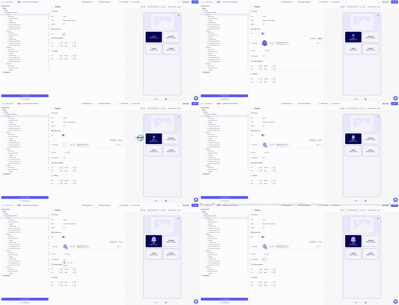
An Icon can be configured for each picker individually. When enabled, you can define:
- the
Imagesfor both states (selected/unselected) - the
Sizeof the image - its
Alignment(Top: above the Texts inside the picker orBottom: below the Labels inside the picker)
Configuring Texts in the collections of Texts
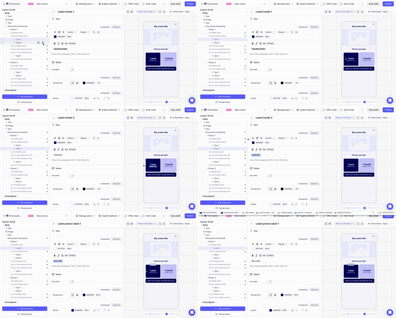
To give you maximum flexibility and allow you to create as many lines and font-styles as you wish, each Picker has a collection of Texts (ex: Promo label, Text inside button...). Texts can be added inside a collection by clicking on the + button:
-
Each collection maps a specific location
-
Depending on the collection, up to 4 Texts can be added, which brings you a lot of flexibility to match the desired design.
-
Within a collection, Texts can be reordered by drag & dropping them
-
Spacing between the Texts can be set by adjusting each Text Top & Bottom margin.
Overriding the Texts of the CTA
In the Plan Picker, the collections starting with CTA allow to override the Texts of the CTA depending on which picker is currently selected:
- When the Picker will be selected by the user, the Texts in these collections will override the default Texts associated at the Purchase CTA level.
- Overriding the Texts is optional but if you override one of them, you must override them all.
Example:
-
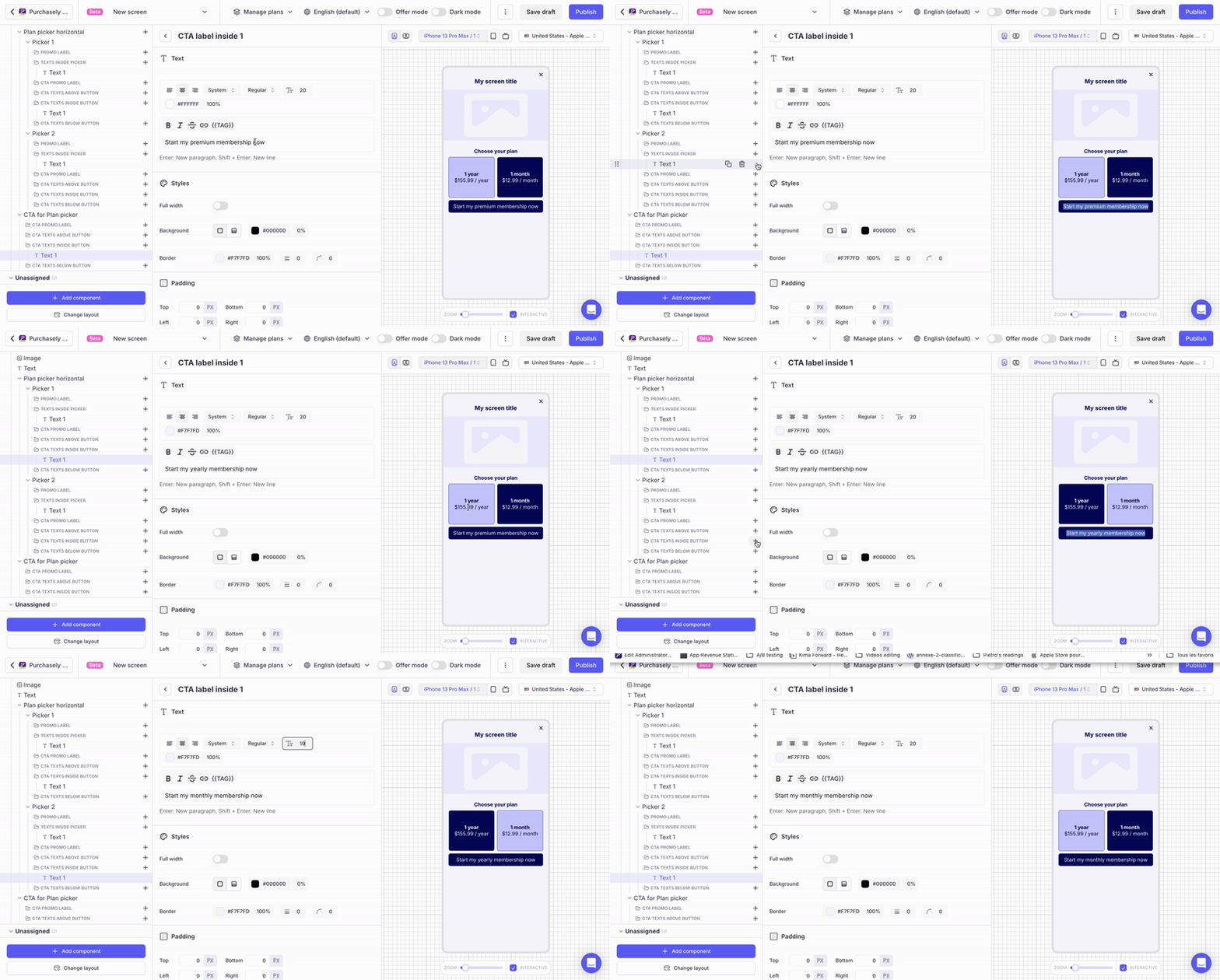
The default Text defined for the CTA is "Start my premium membership"
-
This Text is overridden for each picker:
-
"Start my monthly membership" for the Picker associated to the Monthly Plan
-
"Start my yearly membership" for the Picker associated to the Yearly Plan
-
-
When a Picker is selected, the Text inside the CTA changes to match the value defined at the picker level
Displaying Regular Text vs Offer Text
To give you maximum flexibility and allow you define specific texts depending on the eligibility of the User to an Offer, 2 different texts can be defined for each Label:
Regular text: this text is displayed when no Offer (neither Introductory Offer or Promotional Offer) has been configured for the Plan in the app stores or when the user is not eligible to the Offer.Offer text: this text is displayed when an Offer has been configured for the Plan (either Introductory Offer or Promotional Offer) and the User is eligible to this Offer
Leveraging tags
Tags can be used inside Texts. You can either type them directly in plain text by putting them between pairs of curly brackets (eg: {{PRICE}} {{AMOUNT}} {{DURATION}}). You can also click on the {{TAGS}} button in the bar just above the text input.
If you want the tag to refer to the button mapped with the element, choose the option "Use element's plan / default plan" after selecting your tag:
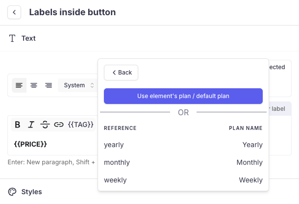
- In this case, the tag should appear without parameters when displayed in the text field.
- The advantage is that you will not need to update the tag if you update the Plan associated to the picker.
If you want the tag to refer to another Plan (eg: to strike through a former price), you can pick the desired Plan directly
Configuring the Promo overlay
You can display a Promo overlay on any button / picker or CTA. A promo overlay is a Text with a background and a border. You can adjust its horizontal positioning by using changing the text alignement (left / center / right) and adjusting the left & right margin
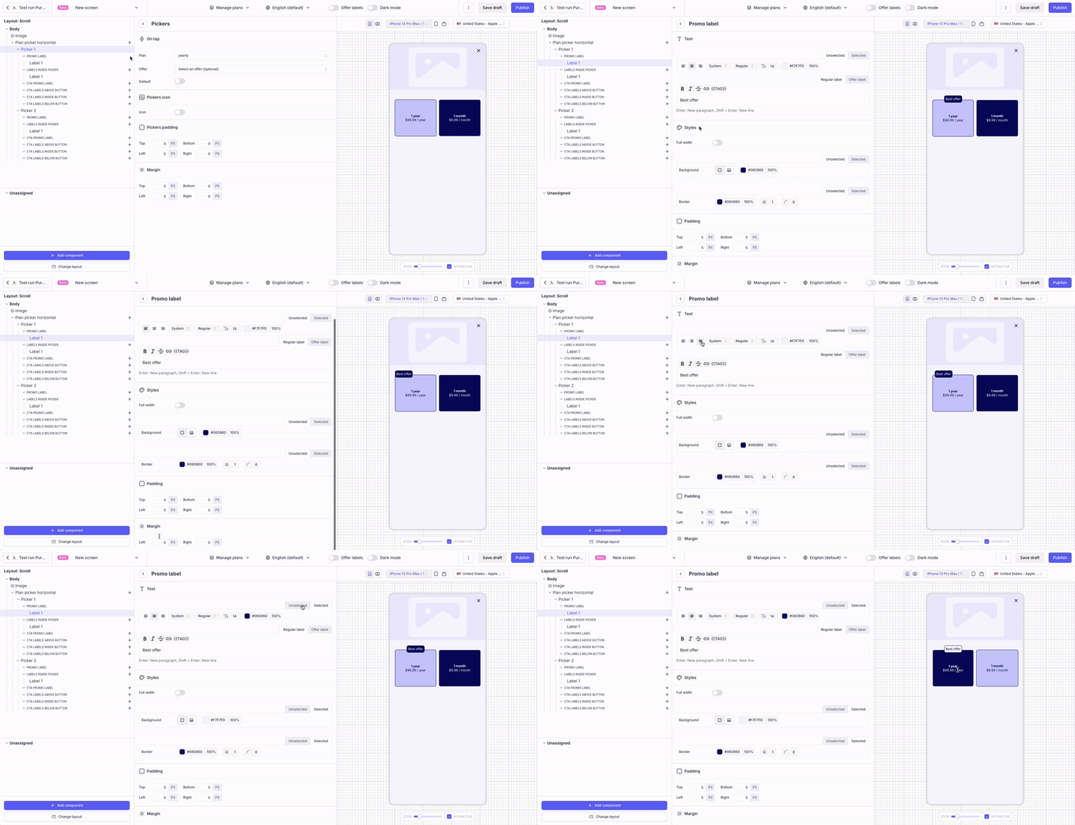
This overlay can be associated with 2 styles: selected / unselected
Updated 6 months ago