
Quiz
This section provides details on design considerations for the component Quiz
The Quiz component allows you to fetch user insights in no-code.
This page explains how to design a Quiz component.
For more details on the basic configuration of the Quiz and its data model, follow the guide: Leveraging Quizzes to fetch User Insights
Integrating the Quiz component into your Screen
Simply drag and drop a Quiz component from the library of components offered by the Screen Composer.
Associating the Quiz component to a data model
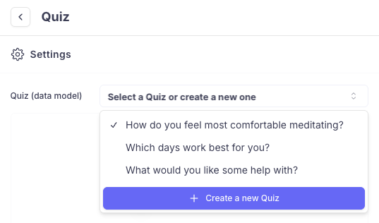
After integrating the Screen, you need to associate it with a data model (field Quiz (data model)) of the component
You can either select a Quiz object created in the section User insights of the Console, or directly create a new Quiz from the Screen Composer by clicking on the button "+ Create new Quiz"
Designing the Quiz component
Configuring the Answers layout and style
Answers styles
Answers styles (except the Texts of the Answers) are common to all the answers and defined at the level of the parent element. They must be defined for both states: unselected and selected
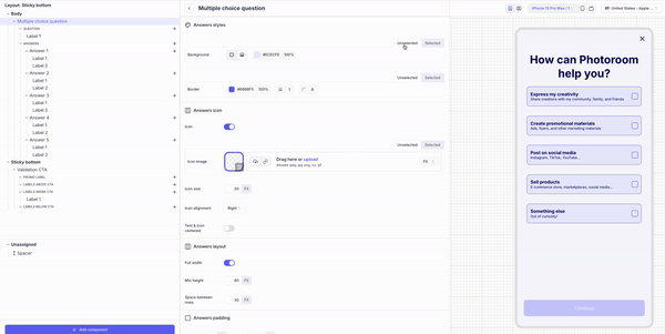
Answers icon
-
You can activate or deactivate the Icon.
-
If you activate it, by default the image applied will be the same to all the answers depending on their state:
unselected/selected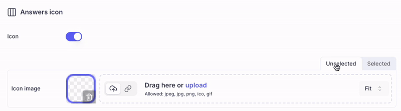
-
Alternatively, you can also define a specific icon for each answer on the answers themselves.
-
The
icon size,icon alignment(leftorright), icon vertical alignement (top,middle,bottom) andvertical offsetcan be adjusted -
By enabling
Text and Icon centered, you can wrap the icon & the Texts inside button at the center of the button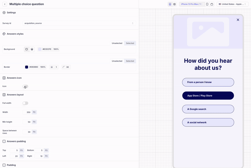
Answers layout
Full width: allows you to extend the answer to fit 100% of the width available. If deactivated, the width of the answer will hug its content.Min height: defines the minimum height for the picker. If the content overflows and does not fit in that height, the answer picker will extend its height.Space between answers: defines the spacing between the pickers
3. Configuring the Question Text(s)
In the Question section, you can add Texts and apply a style to each of them
4. Configuring the Answers available and associated Texts
For each Answer / Option displayed, you need to configure both a Value and the Text(s) you want to be displayed on the Screen.
-
Value: select one of the unique language-independent values configured in the data model of the Quiz.
You can also add a new one by clicking on the button "+ Add a new answer".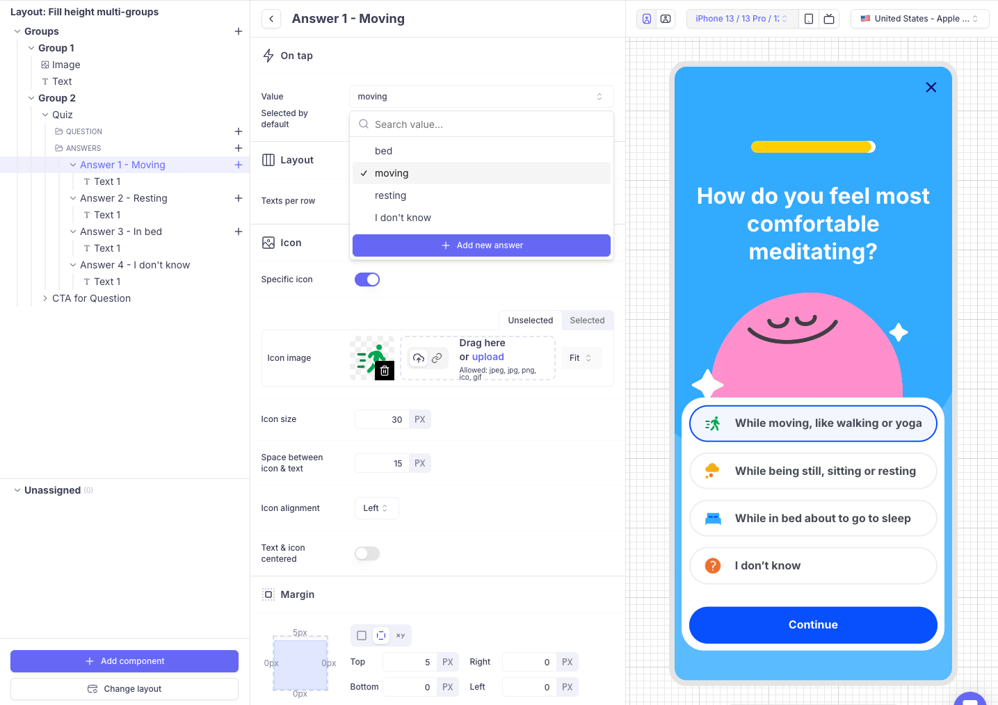
-
Textscan be added as sub-elements of the Answer. They are associated with specific styles and can be localized.
2 users with different locales will see the Texts of the answers localized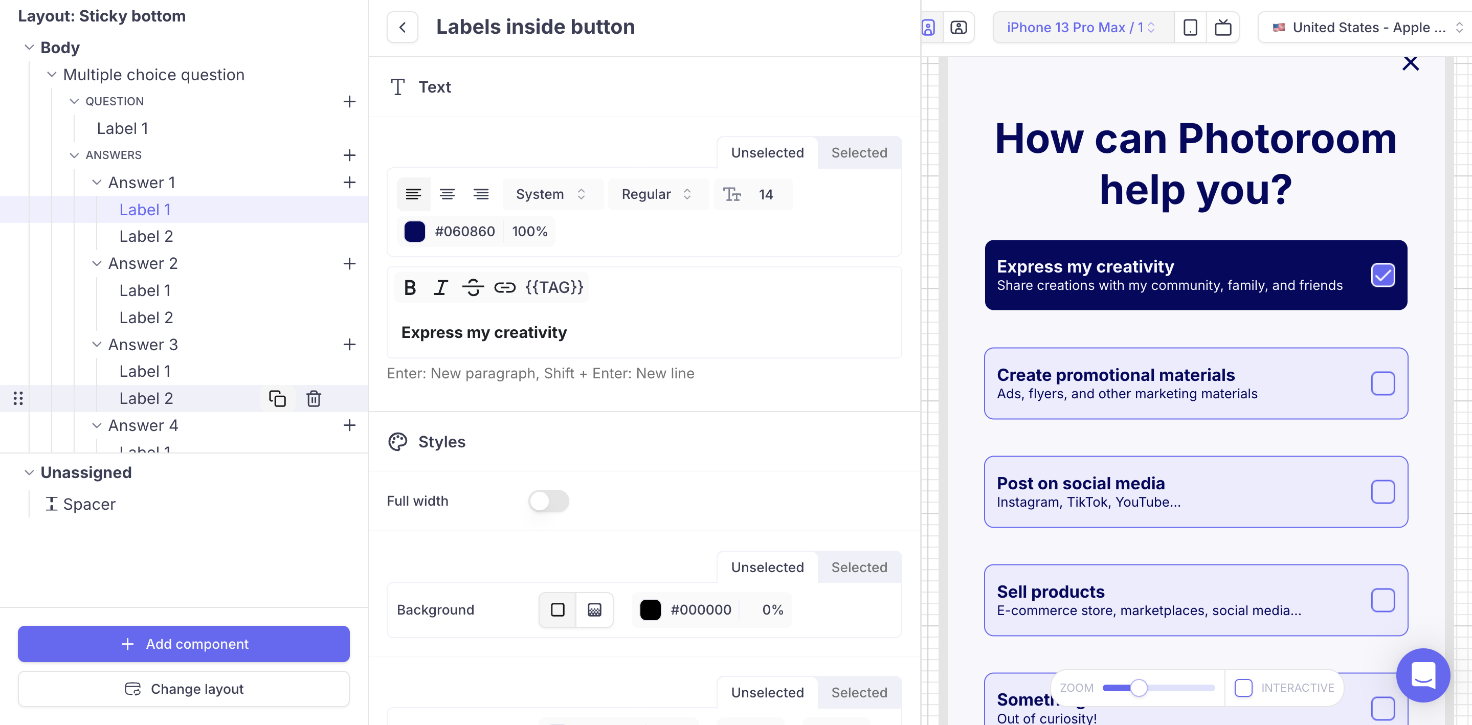
When the switch Selected by default is enabled, the corresponding Answer will be automatically selected by default when the Screen gets displayed, without needing an interaction from the user. This can be used for opt-outs options.
5. Configuring the CTA associated to the Quiz
If the Quiz is configured with the option "Validate on selection" deactivated or the option "Multiple answers" activated, you need to associate the Quiz with a CTA for Quiz
-
if the survey is configured with the option
Validate on selectionenabled => no CTA is required, the answer will be automatically submitted as soon as the user selects it. -
if the survey is configured with the option
Validate on selectiondisabled => you need to add a distinct composantCTA for Quizto your screen so that users can submit their answers.
- In the latter case, click on Add component, then drag & drop the component
CTA for Quizinto the desired surface
Note: This surface can be different from the one containing the Multiple choice question component.
- In the latter case, click on Add component, then drag & drop the component
To make the CTA and the Quiz work together, they need to be associated with the same Quiz (data model).
This CTA for Quiz offers the same display and layout options as a standard button.
Status of the CTA for Quiz:
-
If the Quiz is skippable (parameter
Skippableactivated) or the minimum number of answers has not been selected (Multiple answersactivated andMinimum number of answers> number of answers selected by the user), the CTA will be displayed in the state disabled and it will not be possible to submit the answer / go to the next screen. -
You can define 2 different styles for the CTA depending on its state:
active/disabled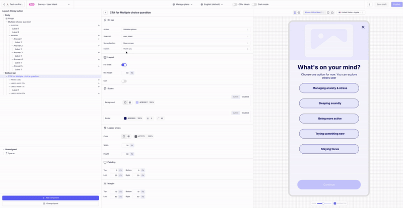
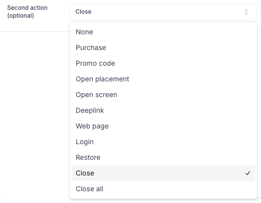
You can also associate the CTA with a second action (optional) that will you Open a Screen, a Placement, a Deeplink or Simply close the current Screen after the answer has been submitted by the user.