
Close button
This section describes options to personalize the close button in the Screens and paywalls.
With SDK version 4.4.0 or above, you have the capability to fully customize the close button displayed in the Screens. This feature can be essential for marketing and product teams as it allows for control over the appearance and behavior of the close button, which can significantly impact user experience and conversion rates.
Here’s how you can customize the close button:
Appearance: Modify the icon, color, size, and position of the close button to align with your brand’s design guidelines.Behavior: Determine when the close button should be visible. For instance, you may choose to display the close button after a daly of 5 seconds.
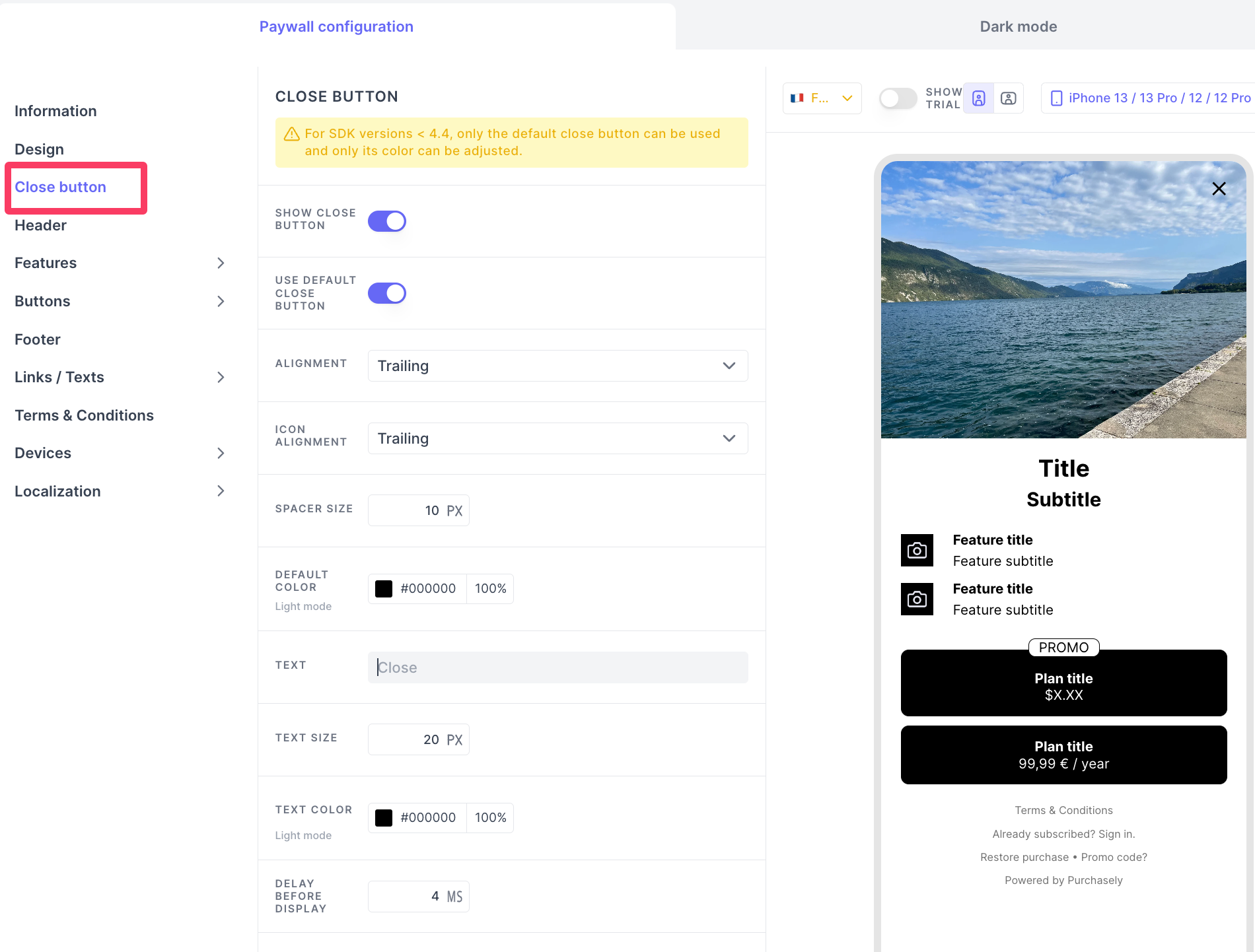
Please find the following list of options available to customize a close button in your Screens and Paywalls.
SHOW CLOSE BUTTON
You can enable or disable to show a close button in your screens.
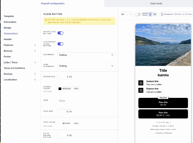
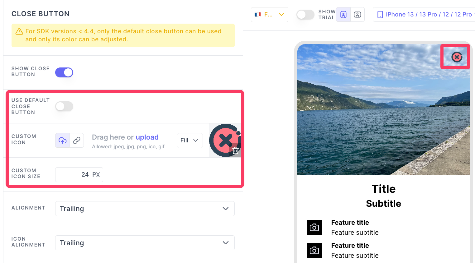
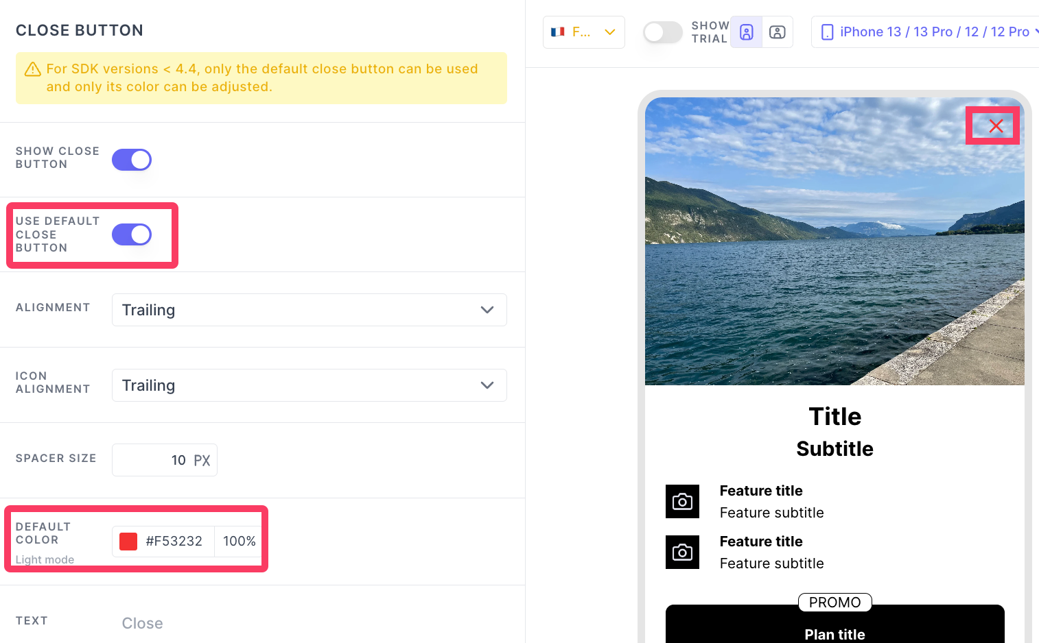
USE DEFAULT CLOSE BUTTON
Purchasely provides close button by default. You can chose to enable it or use your own icon. When you choose to upload your own icon for the close button, you can set the icon size.
DEFAULT COLOR
Color of the close button if you choose to use the default icon provided by Purchasely.
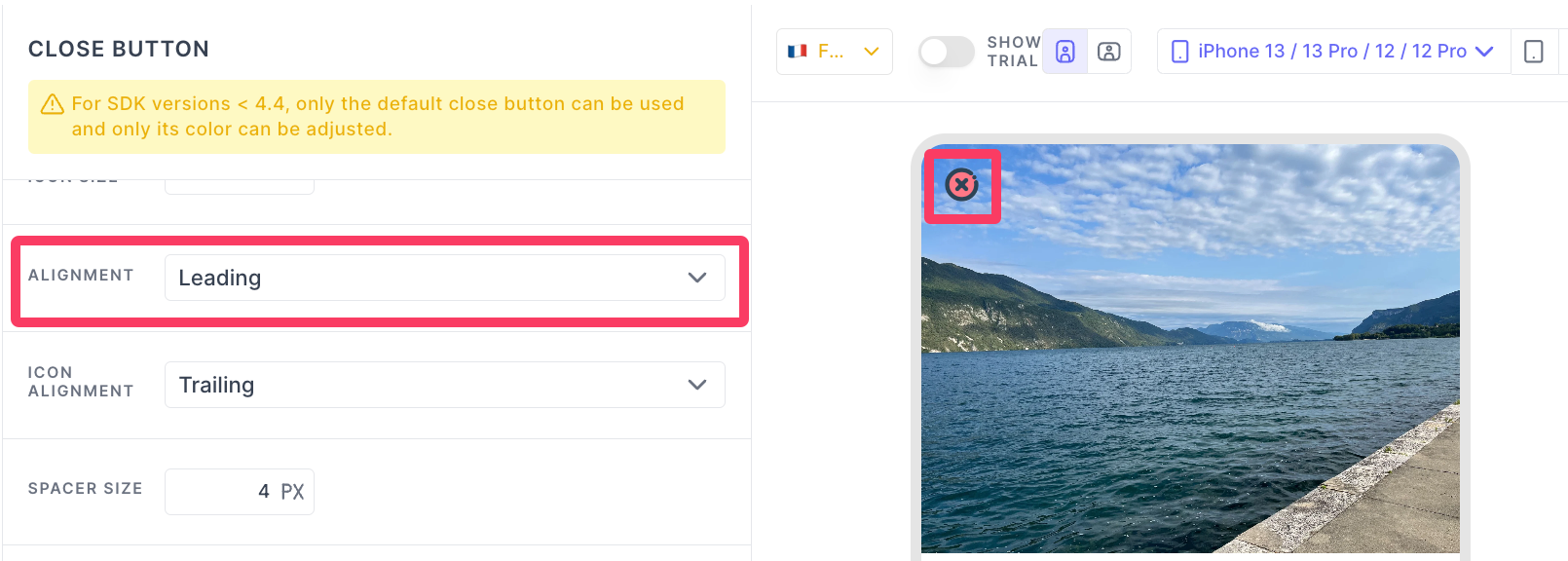
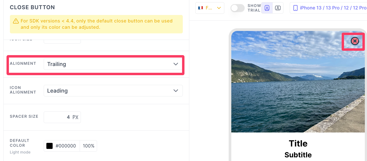
ALIGNMENT
There are three different alignments you can choose: Leading, Trailing and Center
-
Leading: This sets the close button:- to the left of the Screen for left-to-right languages
- to the right of the Screen for right-to-left languages
-
Trailing: This sets the close button:- to the right in the Screen for left-to-right languages
- to the left in the Screen for right-to-left languages
-
Center: This sets the close button to the center in the screen.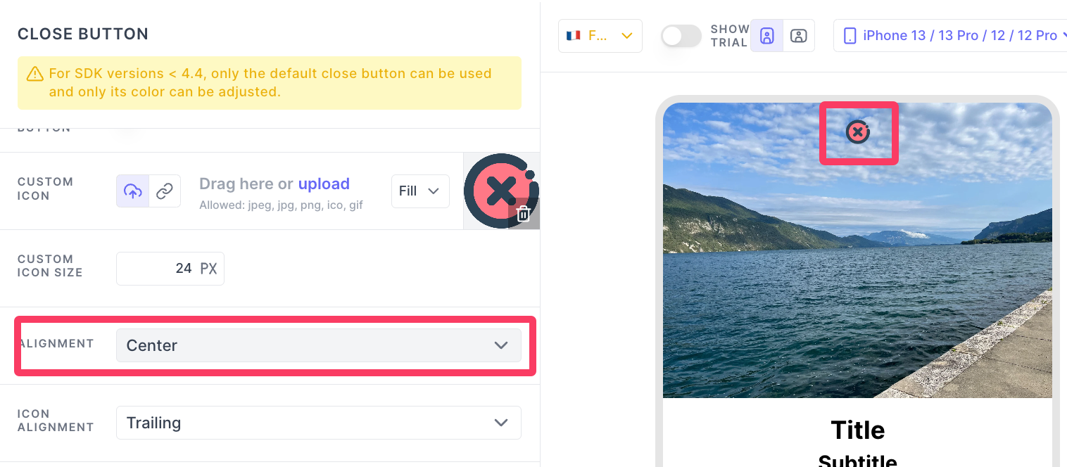
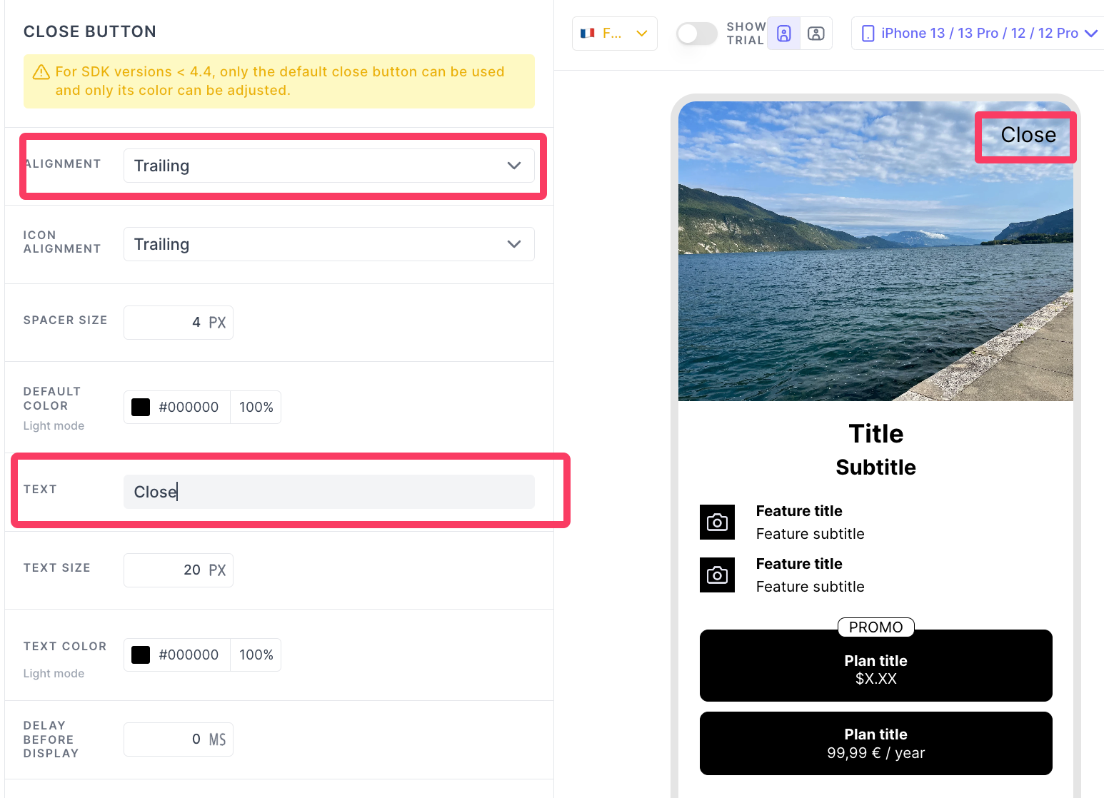
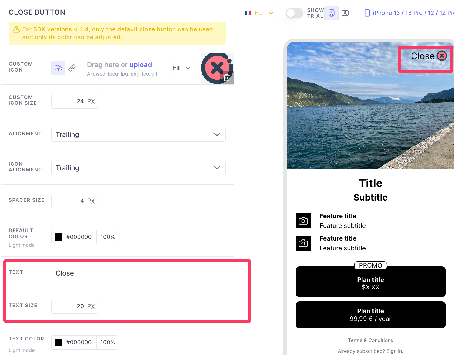
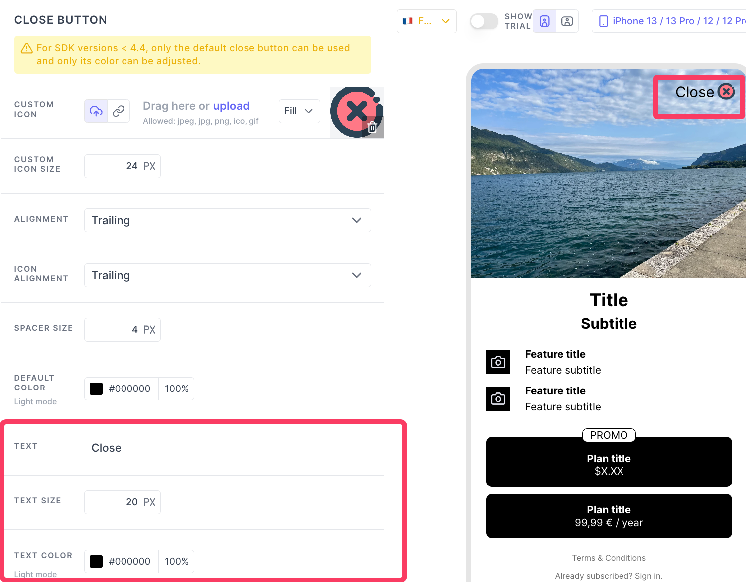
TEXT
You can add a label along side of the close button or just use this label for the close. The text font can't be changed.
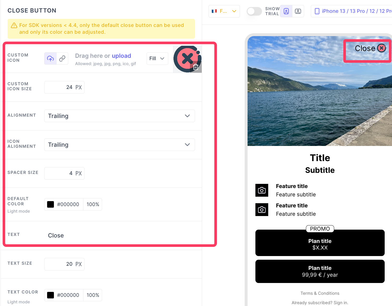
TEXT SIZE
Customize the size of the label you have added here.
TEXT COLOR
The color of the label you have added in the TEXT box
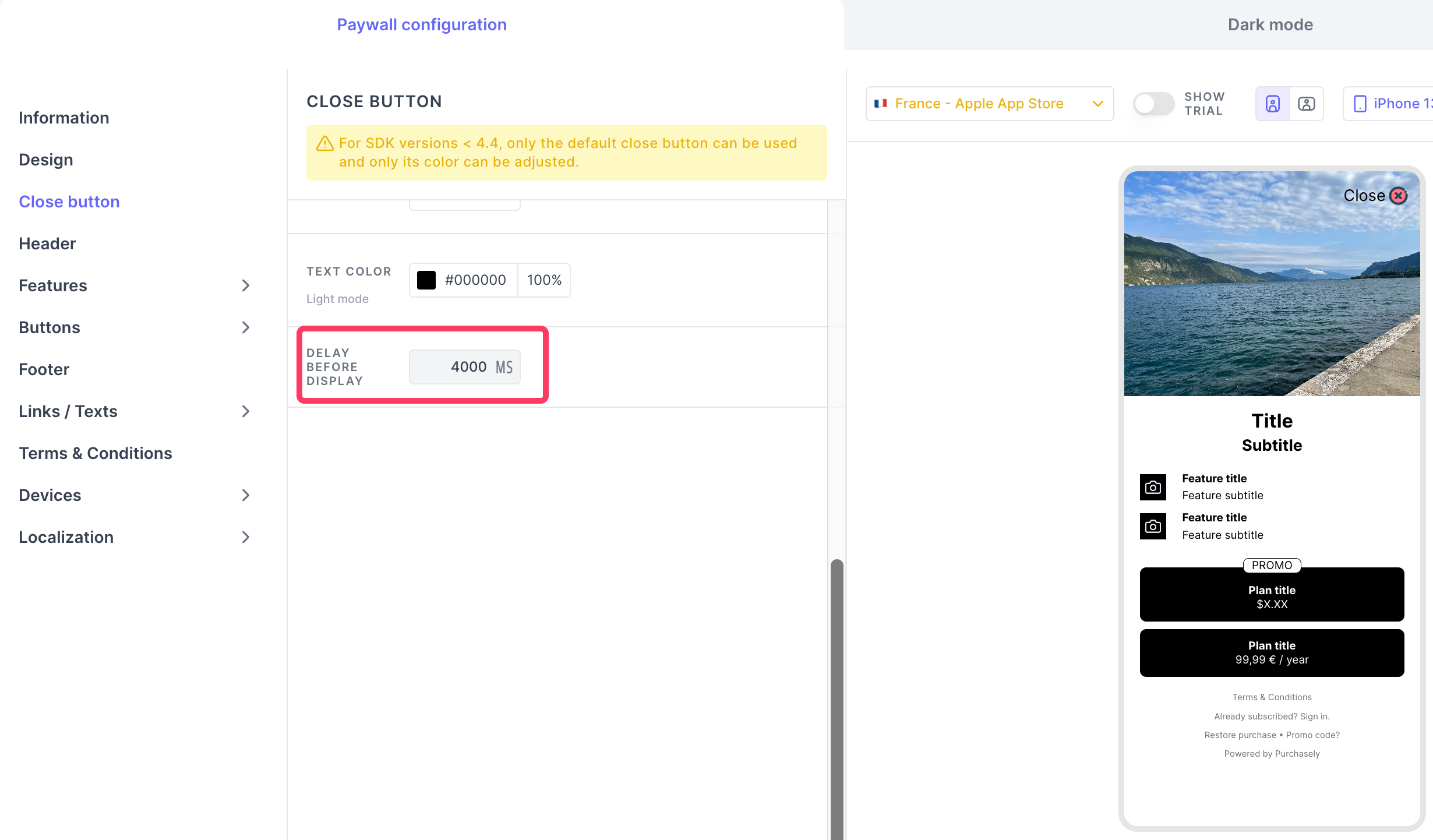
DELAY BEFORE DISPLAY
You can set the delay in milliseconds before which the close button will appear on the Screen: at the Screen opening, the SDK will wait for this time before displaying the Close button.
You should test it in the device directly. Preview will not show the close button with delay.
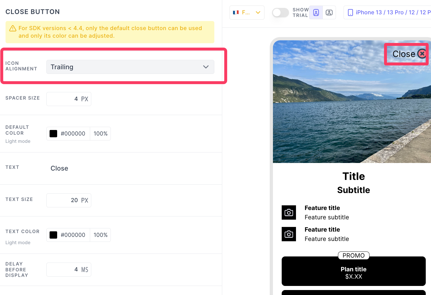
ICON ALIGNMENT
There are two different order you can choose to display the label and the icon
-
Leading: The icon followed by the label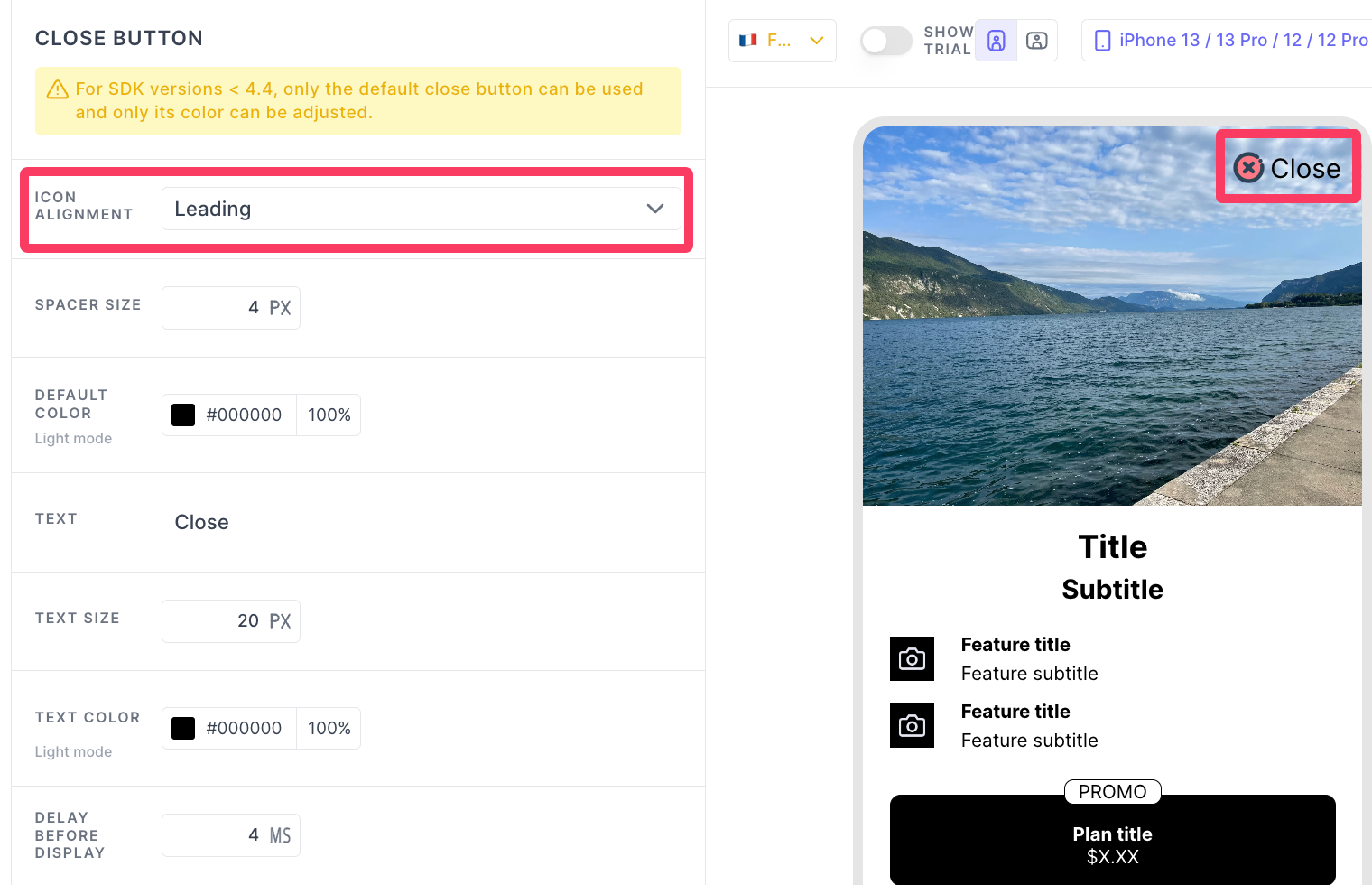
-
Trailing: The label followed by the icon
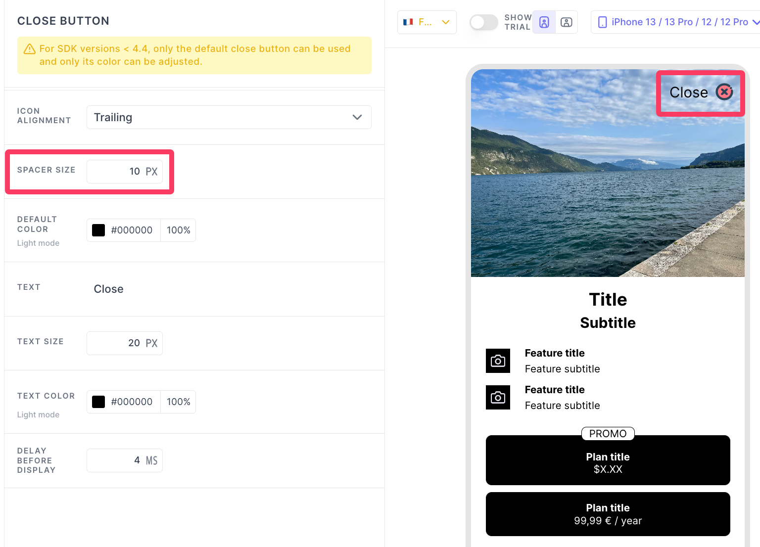
SPACER SIZE
Space between the close icon and the label you have provided in the TEXT box.
Updated 4 months ago