
Template system
This page describes various elements present in the Purchasely Screen Builder templates and their application and customization
Purchasely provides more than 60 templates for you to create Paywalls, onboarding screens, payment update reminders and all other Screens you would like to create in no-code.
Purchasely proposes a set of fully customisable templates to choose from. These templates are compliant with both Apple and Google Store review guidelines to help you pass the App Review.
On all the templates, you will find a set of shared components. Let's dig into them!
Assets and copy
Images
In the templates you can add with format: jpeg, jpg, png, ico, gif. You can adjust an image to fill or fit the display on a device.
fill: Adjusts the image to cover the entire container, filling all available space, which may result in cropping parts of the image and altering the original aspect ratio.fit: Adjusts the image to ensure the entire content is visible within the container, maintaining the original aspect ratio, and potentially leaving empty spaces on the sides or top and bottom.
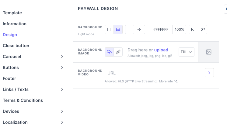
Colors and gradients
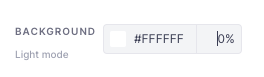
You can customize the colors of the button, Screen background.
For a color, you can either enter the hexadecimal code or use the color picker.
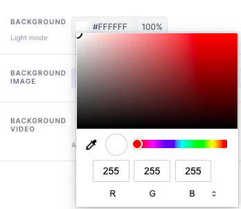
You can also adjust the level of transparency of the color (0%: transparent, 100%: opaque)
You can also use gradient colors.
Every color defined in the Screen Builder for the light mode can be overridden in dark mode.
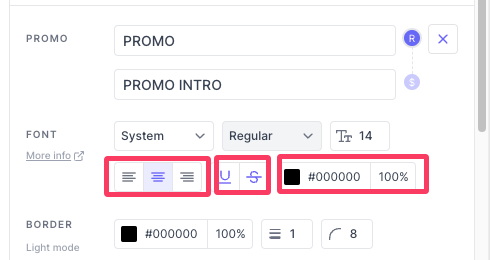
Texts
In addition to the font, style and size, you can also customize their alignment, underline or strike through texts, change the text color.
Custom fonts can also be integrated into Purchasely Screens.
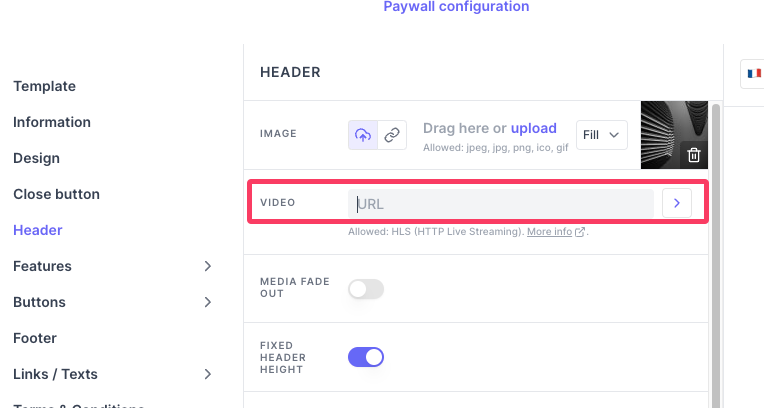
Videos
You can add videos in the header or design section in any screen templates. The video format should be HLS, you can use any cloud platform to convert and store your video. You can provide the URL of the video stores in the cloud server.
More details on video integration here.
More details on integrating a video player on Android devices here.
Components
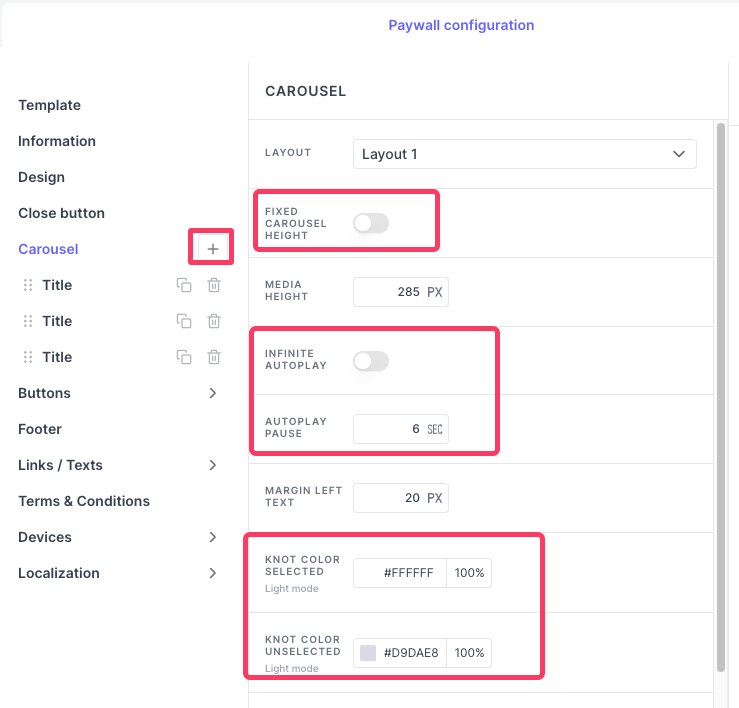
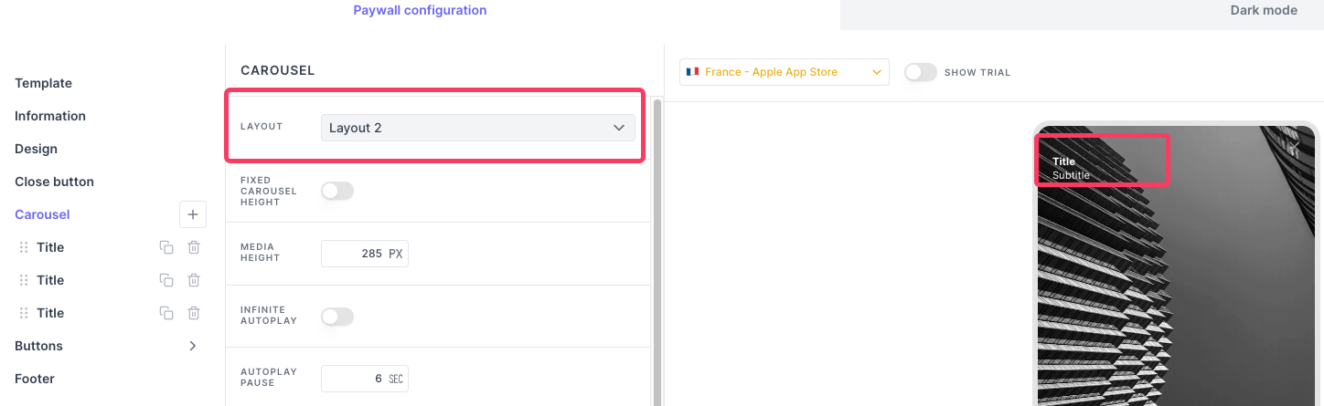
Carousel
Objective: A carousel is a type of interactive feature that displays various contents in a rotating or sliding format.
Customization: You can add as many tiles as you want. You can add a new tile by pressing the + button.
In addition, you can personalize: the color of the carousel dots and adjust the carousel height to your preference. You can enable infinite autoplay, where the carousel slides advance automatically, and set the autoplay pause duration, which is the time interval between each slide transition during autoplay.
You can add title and subtitle to the carousel to each slides,
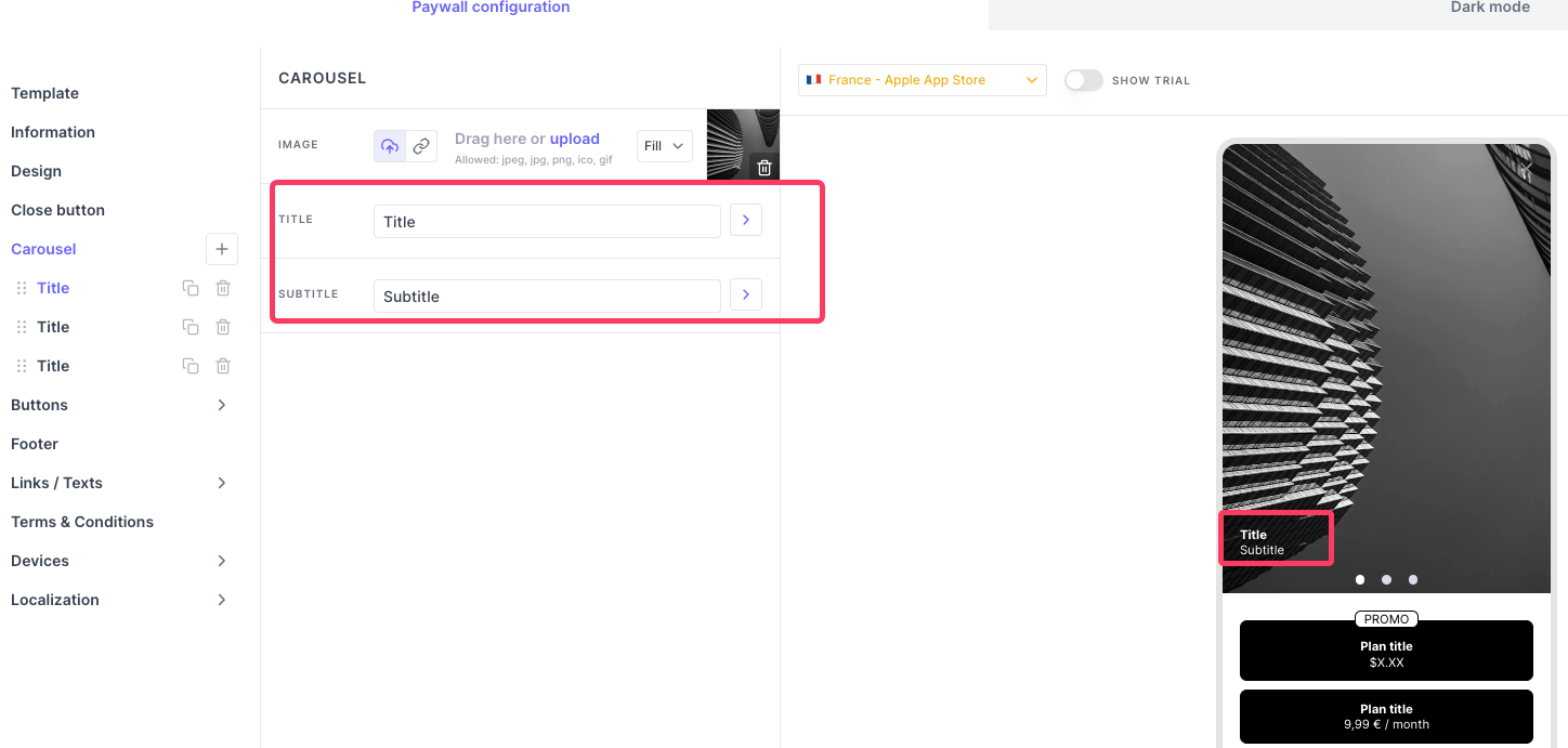
To modify the layout of these titles, you can change the layout option under Carousel tab.
Note:You cannot add video to the carousel slide.
Feature list
Objective: Potential subscribers can see exactly what they are paying for, which helps them make an informed decision about whether the subscription is worth the investment. Clearly listing features reduces any uncertainty or hesitation about subscribing, as users know what to expect.
Customization: You can add as many features as you want. You can add a new feature by pressing the + button.
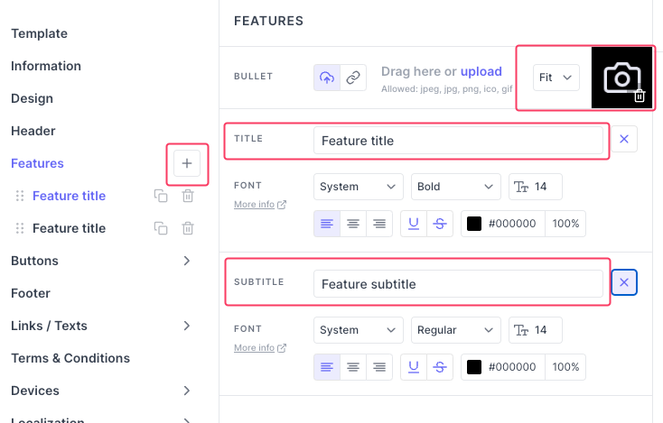
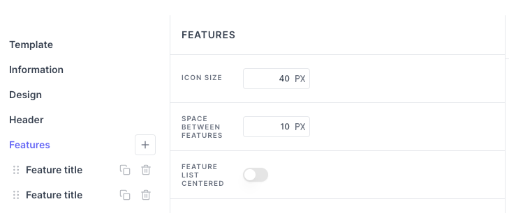
You can customize the icon size, spacing between each and every features and the feature list placements using the options under the features tab
Tips:If you have added long list of features which pushes your buttons way down, you can make them sticky by so the end user will have to scroll in order to read the features at the same time the buttons will stick to the bottom of their screen in any device size.
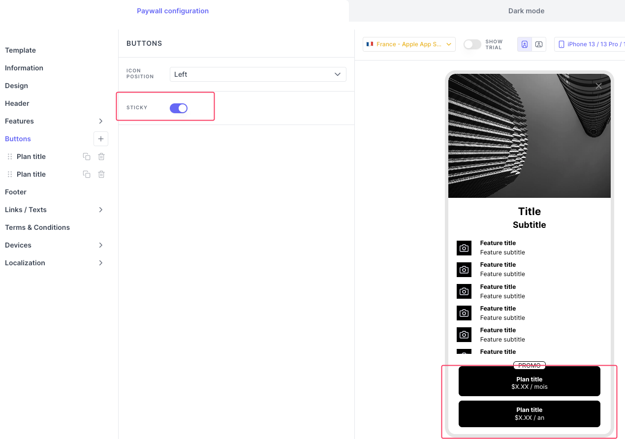
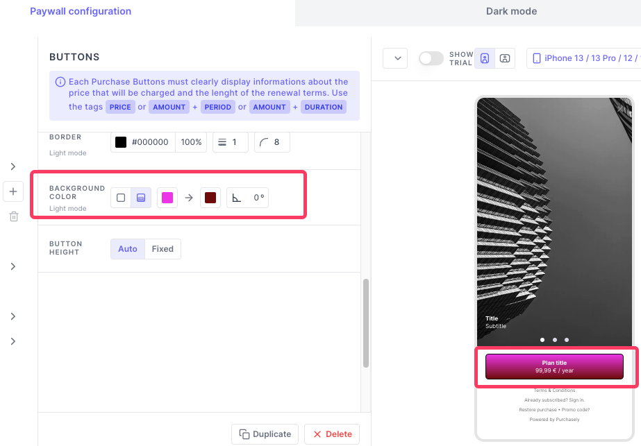
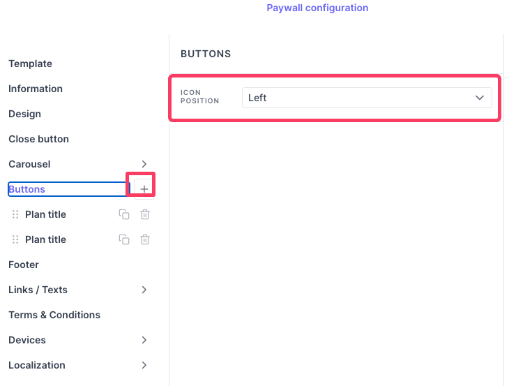
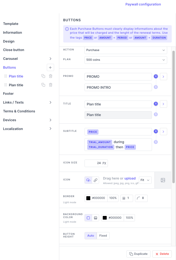
Buttons
Objective: A button let the user interact with the Screen and perform a specific action that you can define. By default, the buttons are linked to the action purchase.
Customization: You can add as many buttons as you want. You can add icons and texts to the buttons. And you can adjust the placement of the icon under Buttons tab.
When its a purchase button, then its mandatory to show the plan price using our tags. (link)
You can add promo text, titles and subtitles. The text box marked as R should have texts displayed for all users, the text box marked as $ should have texts displayed for users who are eligible for the free trial or Winback offers.
More details on regulars labels vs offer labels here.
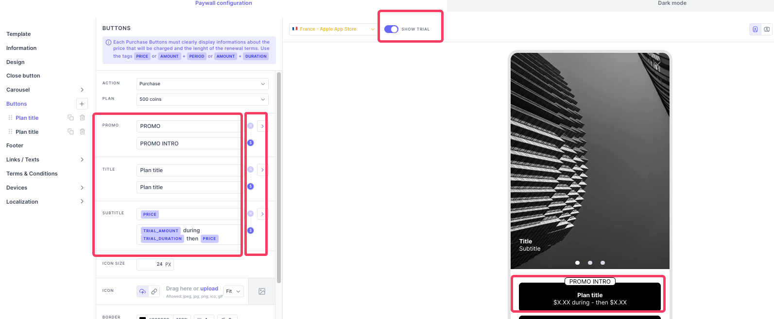
You can add icon to the button, adjust its size. You can also change the button color and height.
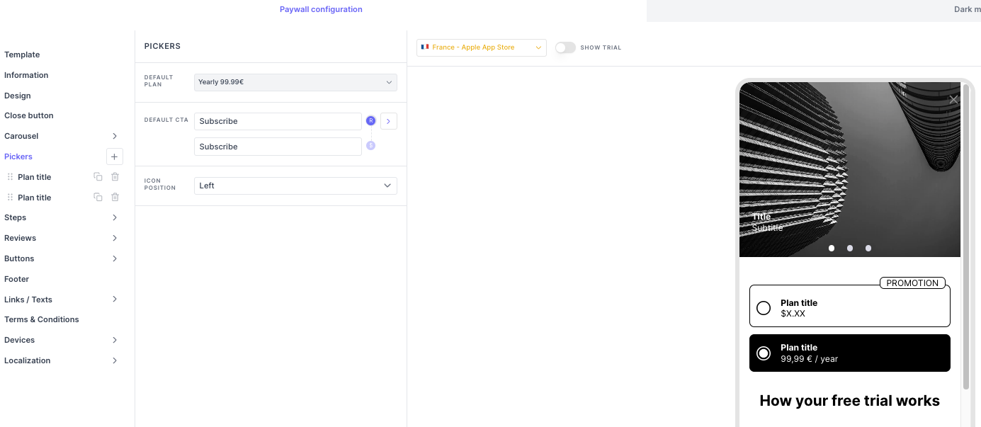
Pickers
Objective: The pickers are used to show different plans you offer. Users can change the selected Plan by tapping the corresponding picker. They come with a subscribe button. Some templates have pickers and some other have purchase buttons. The major advantage of using pickers is that you can pre-select a Plan in the Paywall.
Picker custom actions:You can use picker buttons for actions Purchase or Winback/ retention offers only
Customization: You can add promo text, titles and subtitles. The text box marked as R should have texts displayed for all users, the text box marked as $ should have texts displayed for users who are eligible for the free trial or winback offers.
More details on regulars labels vs offer labels here.
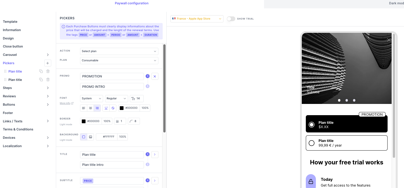
To set a plan pre chosen by default, you have to set them in the Pickers tab.
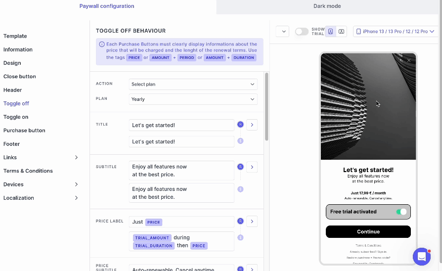
Switch
Objective: Switch is an effective interactive element to make a free trial optional or propose different Plans depending on the state of the switch. This approach can engage users and make the process more dynamic.
When the switch is turned on, you can associate a different Plan (e.g.: one associated with an Introductory Offer in the app store), and write a different message.
Customization:
- Toggle
off: In the toggle off button you add the Plan that offers no free trial.
Toggle on: In the toggle on button you add the plan that offers free trial.
Purchase button: This purchase button upon clicking proceeds to the Apple/Google payment page.
TipsIf you add same Plan in Toggle off and Toggle on then the switch doesn't work. So, please remember to add different Plans in the Toggle off and Toggle on.
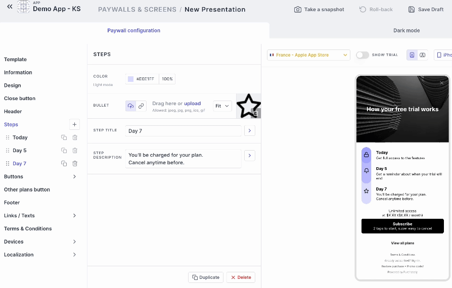
Steps
Objective: Steps element is inspired from the Blinkist Paywall, a famous audio book app. It is a perfect tool to build trust with end-users by explaining transparently how the Free trial works, when they will start to be charged, and allowing them to get a reminder 2 days before.
Customization: You can customize the icons for every step, and the titles and description.
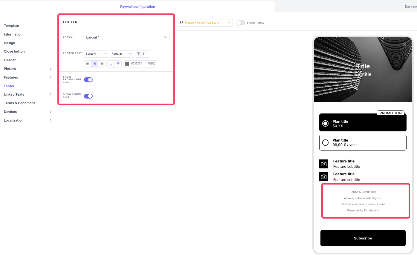
Footer
Objective: The Footer tab lets you customize the entire footer part of the paywall. The links/texts, terms and conditions, Restore Purchase and login.
Customization: You can change the layout to change the order of how the footer elements are presented.
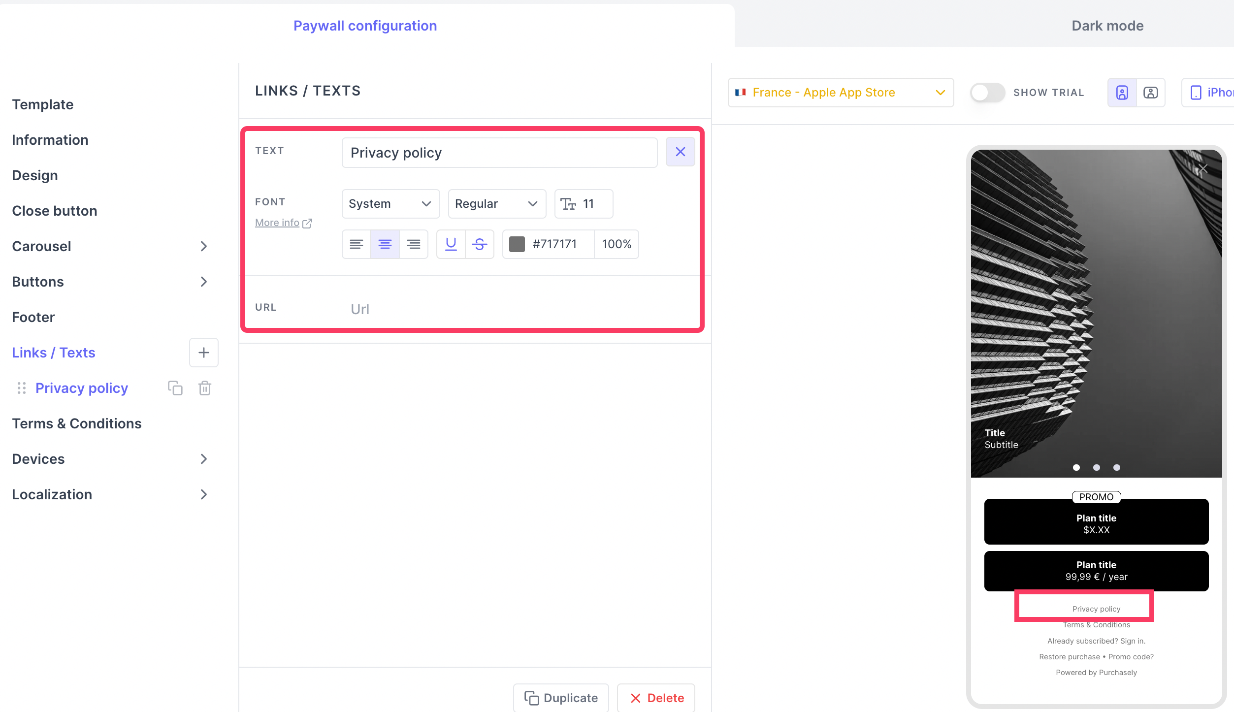
Links/Texts
Objective: With the Links/texts you can add more things in the footer. You can add link to Privacy Policy, Customer survey and etc.
Customization: You can add just texts or label with an URL that can redirect to a privacy policy page in your website for example.
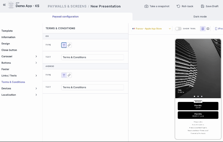
Terms and Conditions
Objective: As per store guidelines, it is mandatory to add Terms and Conditions about the subscriptions sold. Hence, Purchasely Screen builder provides you with a section to add the Terms & Conditions.
Customization: You can add a Terms and Conditions as a texts or label with an URL that can redirect to a Terms & Condition page in your website for example. Different Terms & Conditions can be defined for iOS and Android.
Tips:The different footer layout works best when you choose to use the terms & conditions with an URL.
Updated 5 months ago