Adapting Screens to devices
This section provides details on how to adapt Screens for different screen sizes
Your users are accessing content on a variety of devices with different screen sizes and form factors, including smartphones, tablets, and TVs. To enhance user experience, your paywalls needs to adaptseamlessly to these variations.
Screen and Paywall Builder allows you to preview and perfect your designs on any device type, ensuring optimal appearance and functionality. You can even preview your designs on your own device using a QR code.
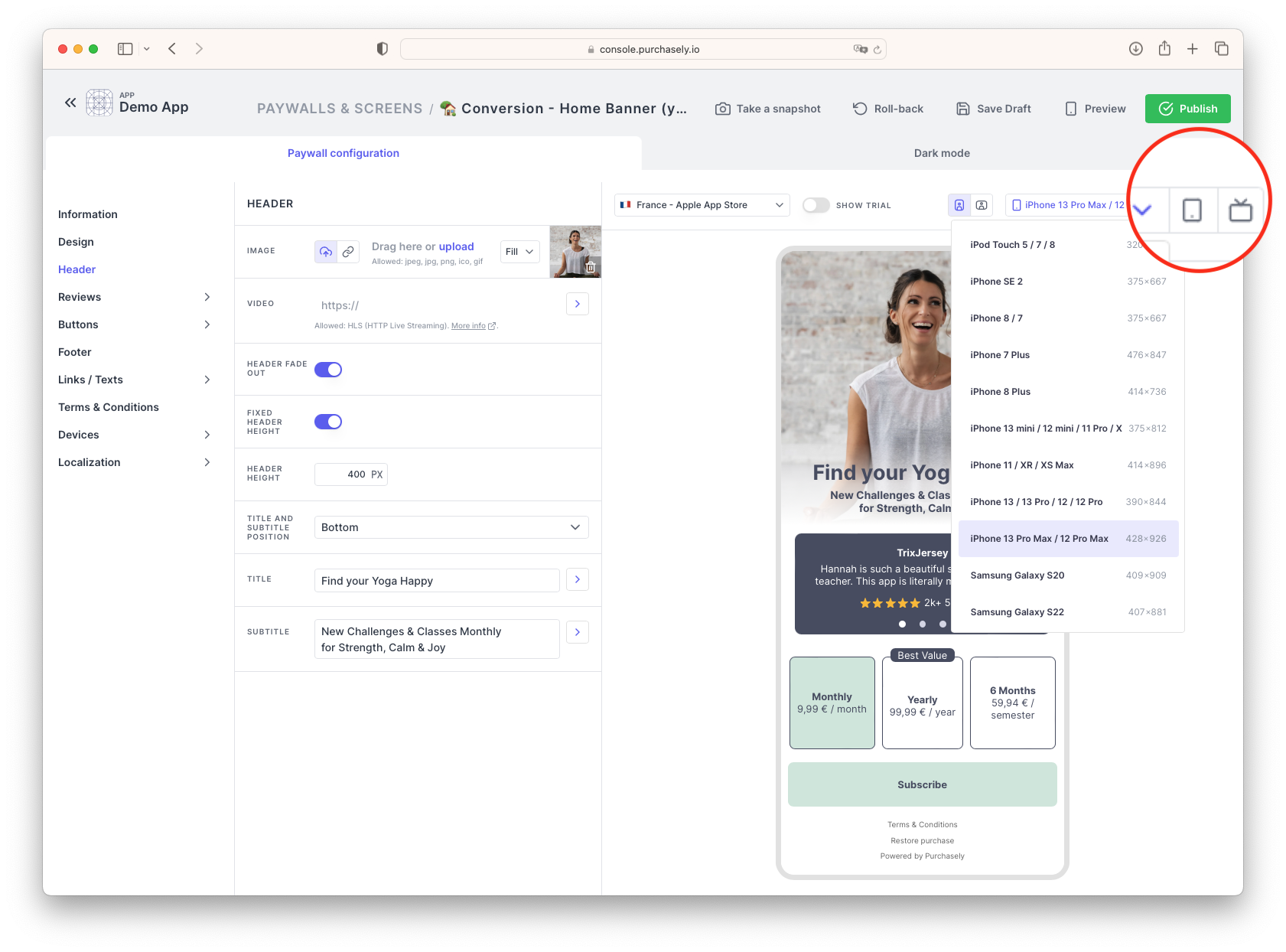
With Purchasely screen and paywall builder you can preview your designs on any device.
Purchasely offers several features to ensure your paywalls look great across all devices:
- Responsive templates
- Device-specific images
- Customizable sizes (fonts, spacers, components, etc.)
- Orientation-specific templates
Responsive templates
Purchasely uses templates to display screens tailored to each device type. These templates adjust to the proportions, sizes, and orientations of different devices, ensuring your paywalls look and feel optimal on smartphones, tablets, and TVs. Our paywall grids adapt dynamically to make the best use of available space.
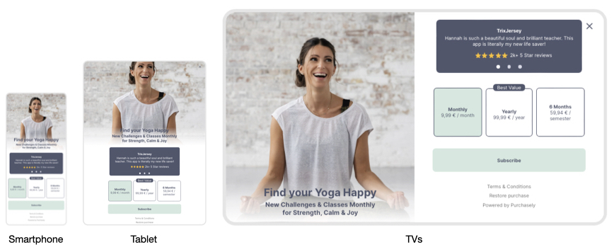
Exemple of how templates adapt layouts to utilize space appropriately on each device.
Customizable Sizes by Device
A 12pt font size may look perfect on a smartphone but not on a tablet or TV, where the screen is farther away. Purchasely's paywall and screen builder lets you customize sizes for each design element by device type. Simply select the device type and set your desired values. The preview will automatically switch to the selected device, allowing you to see changes instantly.
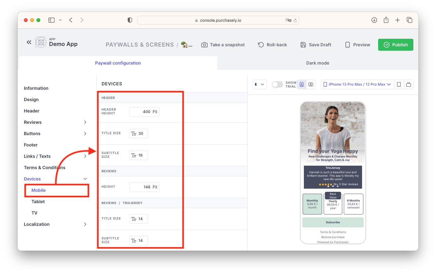
Override each component and font size for each device type to achieve the best design
Device-Specific Images
Templates and sizes can vary with device type, and so can images and videos. Purchasely allows you to set different images and videos for each device type in the same section where you customize sizes.
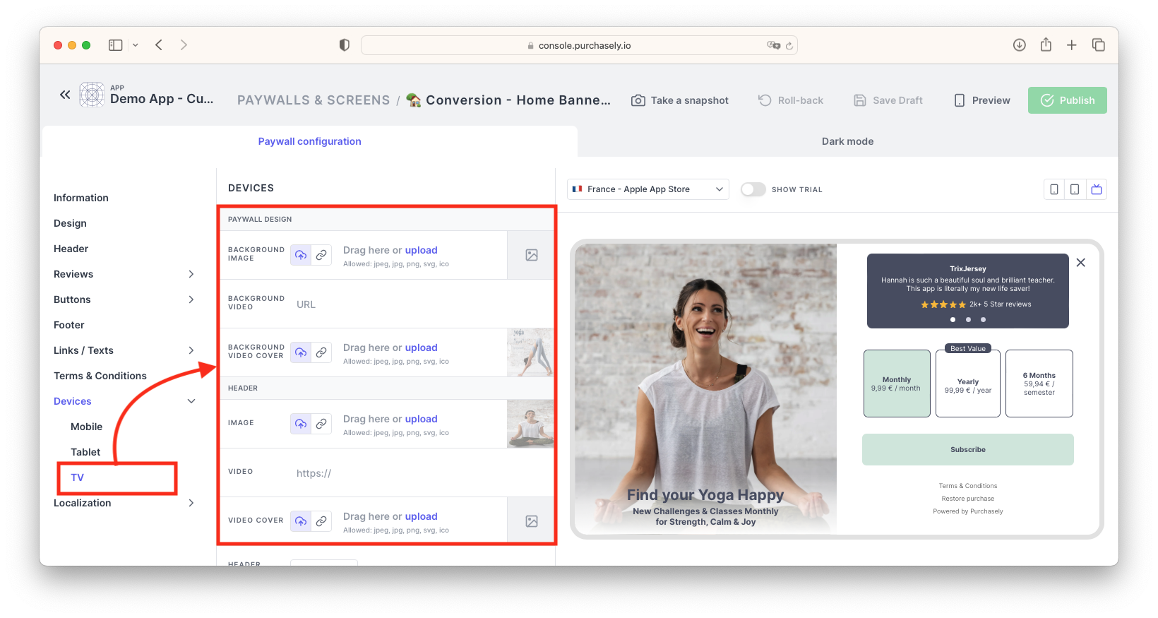
Example of custom images for TV
Orientation-Specific Templates
Purchasely offers numerous templates to fit the orientation of your device. Whether your app is primarily used in landscape mode, like many games, or portrait mode, you will find suitable options to display your paywalls effectively.
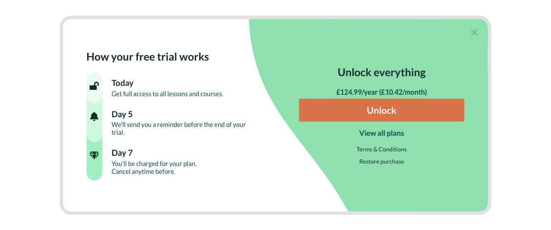
Example of a landscape paywall
Updated 5 months ago