

Expandable Pickers
This page illustrates what is an expandable picker and how to configure it for quiz or payment screen
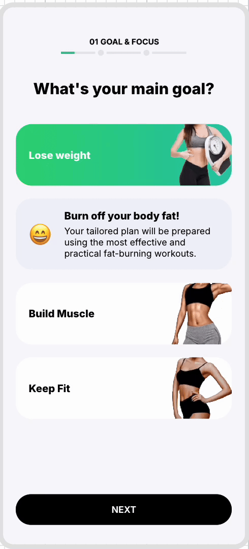
Expandable picker is a paywall component that allows users to view and select subscription Plans or one-time purchase options. User can choose which Plan they want to purchase and confirm it by clicking on a purchase CTA.You can use this picker in a screen when you want to display a plan to purchase or in a screen where you ask to a customer and collect their responses.
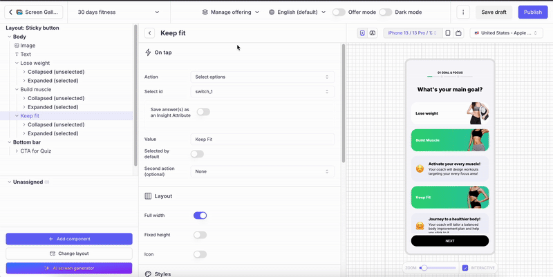
Quiz example:
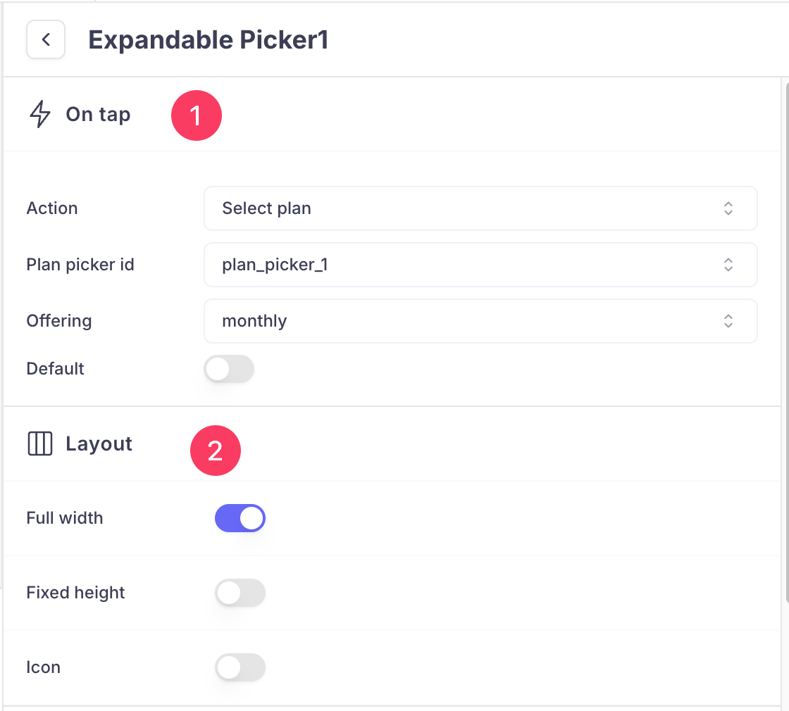
Payment screen example:

These pickers are special in a way that you can include more details about a plan or an option and clicked upon which expands those description and collapses when another picker is selected. Hence you can configure the part for Expanded/selected picker and collapsed/unselected picker
Configuration
Expandable picker structure
The Expandable picker has the following structure:
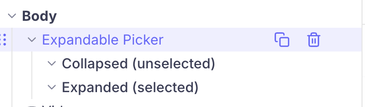
The component is composed of:
- a parent element (highlighted on the picture above), where general configuration options valid for all the Expandable pickers can be defined
- child elements that represent what elements to display when the picker is collapsed or unselected and what elements to display when the picker is expanded or selected
Configuring the general parameters of the component
Here are all the parameters that can be adjusted for the Expandable Plan picker:
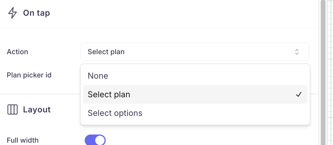
On Tap
-
Action: It can be either select plan for purchase action or select options for a quiz answer submission
-
Plan picker id: Id of the plan picker, if you have same id for all your plan picker, they work as same. If you select a plan or an answer. Like hive minds in Stranger things 😂 . In this case, only one picker will be active at a given time.
If you have given different names to the picker, they are independent. Our SDK has an new feature to recognize the selected choice, hence you have this ability to choose the Action as Select plans or actions.
- Offering: When you have selected your picker action to be Select plan, then you choose which plan to be linked with this picker.
- Default: If you turn on this radio button, this picker will be chosen by default when the screen is rendered to the user.
Layout
In this section, you can customize the overall layout of the picker like height, width and set icon.
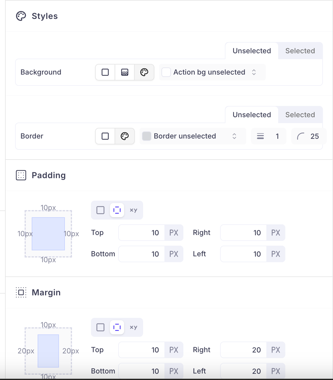
Styles: Set background color and border for your picker here.You can customize it for both selected and unselected mode.
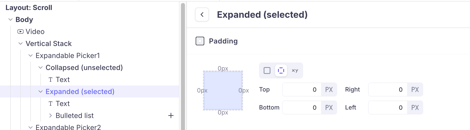
Padding and Margin: Padding is the space between the content of an element and its border. Margin is the space outside the border of an element, pushing it away from surrounding elements.
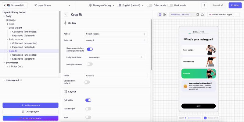
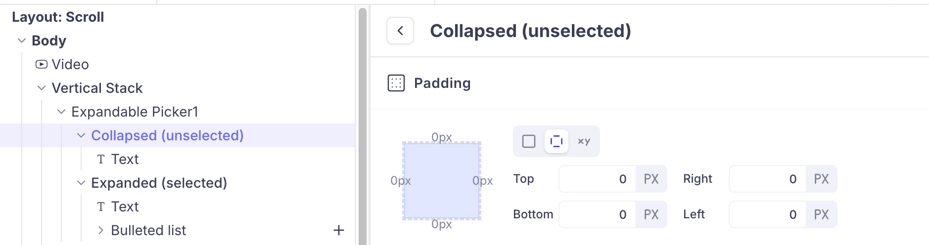
Collapsed(unselected) and Expanded(selected):
You can add any number of components. You can use Vertical stack to organize those elements in a Expandable picker.
Inside Collapsed and Expanded section, you can adjust the padding. Rest of the configuration can be
Updated 9 months ago