

Visualizing User Navigation and Analyzing Flow Performance
This page provides details on the diagrams and data available with Flows
Analyzing a Flow
To help you better understand how users interact with your Flows, Purchasely provides a dedicated Sankey Diagram dashboard.
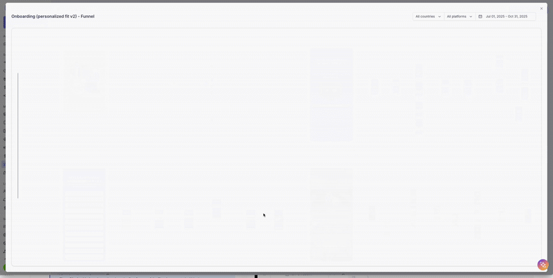
This visualization lets you see, at a glance, how users move from one screen to the next, which paths they follow, and where they drop off along the way.
By mapping the entire journey—from entry to exit—you can quickly identify friction points, optimize transitions, and fine-tune your Flow to increase engagement and conversion. It's a powerful tool for turning user behavior into actionable insights
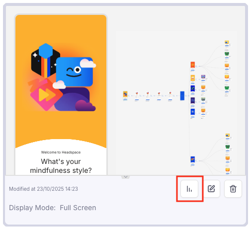
You can access the Diagram of a Flow by clicking on the Following button
You can use the components in the top right corner to refine the dates and filter the data by platform or country.

Tracking events generated within a Flow
UI / SDK events & Server events (e.g.: PRESENTATION_VIEWED,SUBSCRIPTION_STARTED, TRIAL_STARTED, TRIAL_CONVERTED and all subsequent lifecycle events such asSUBSCRIPTION_RENEWED, RENEWAL_DEACTIVATED, SUBSCRIPTION_TERMINATED) generated through a Flow will cary the flow_id .
Sample events:
{
  "event": {
      "properties": {
        "event_name": "PRESENTATION_VIEWED",
        "event_created_at_ms_original": 1750839495518,
        "event_created_at_original": "2025-06-25T08:18:15.518Z",
        "app_installed_at": "2025-06-24T14:13:51.662Z",
        "anonymous_user_id": "DD844D32-7E64-4F7D-8CA2-C2D3AEB84BE0",
        "type": "PHONE",
        "os_version": "iOS 18.1",
        "sdk_version": "5.3.0",
        "language": "en",
        "display_mode": "modal",
        "orientation": "portrait",
        "placement_id": "COURSE_MATCHING",
        "displayed_presentation": "question_time_spent",
        "presentation_type": "NORMAL",
        "flow_id": "onboarding_personalized_fit_v2",
        "flow_version": "52",
        "step_id": "79ec729d-b601-43e9-ac74-61f1cc8b70a8",
        "from_step_id": "b2720048-dc4c-4988-9133-555dbcca4e44",
        "from_action_id": "ecf27b8c-13db-4367-afda-cfb608518304",
        "flow_session_id": "A30666D8-6736-42FA-A80A-152A0C50469D"
      },
      "user_attributes": { ... },
      "built_in_attributes": { ... },
      "name": "PRESENTATION_VIEWED",
      "id": "168BBEAB-CEF8-4FEB-AD1B-8E28CD3FCC49"
    }
  }
}
Updated 9 months ago