

Progress Bars
This page describes the Progress bar component in Purchasely Screen Composer
Progress Bars help you visualize user progressionat a glance and guide users through multi-step experiences with clarity and motivation.
They are especially useful in Flows, onboarding journeys, questionnaires, or any step-based experience, where showing progress helps reduce friction, set expectations, and increase completion rates.
Benefits of using Progress Bars
- Give users a clear sense of where they are and what’s left;
- Reinforce engagement by making progress visible and rewarding;
- Create smoother, more transparent user journeys across your app.
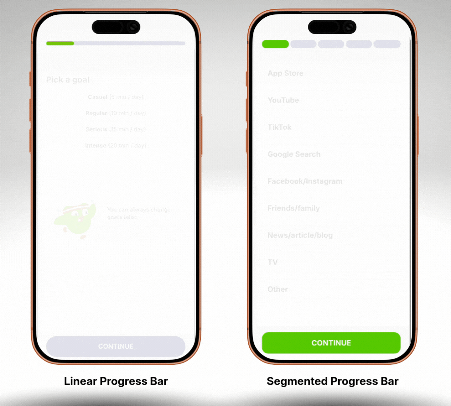
Purchasely provides you with 2 types of progress bars:
Progress Bars Configuration
Progress Bars are fully customizable to match your app’s layout and visual identity.
Steps-based logic
Progress Bars rely on a very simple step-based configuration.
To set them up, you only need to:
- Define the total number of steps in the journey
- Specify the current step for the screen where the Progress Bar is displayed
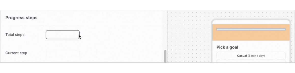
That’s it!
The Progress Bar automatically calculates and displays the corresponding progress, making it easy to reflect user advancement without complex logic or dependencies.
This lightweight setup allows you to quickly add Progress Bars to any step-based experience, while keeping full control over how progress is represented across screens.
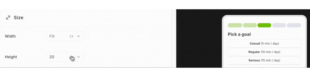
Size
You can adjust the dimensions of the Progress Bar to fit different screen contexts:
Width: Define how the Progress Bar adapts to the screen or container
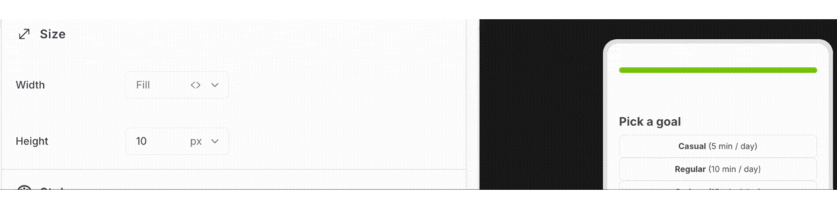
Height: Control the bar thickness for subtle or more prominent displays
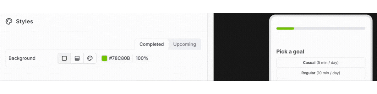
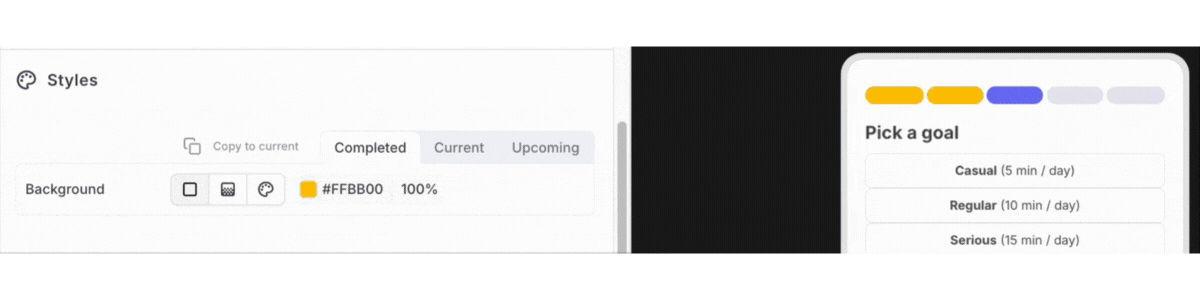
Styles
Progress Bars offer flexible styling options depending on the selected type.
For Linear Progress Bars, you can define different colors for:
- Completed steps
- Upcoming steps
For Segmented Progress Bars, you can configure distinct colors for:
- Completed steps
- Current step
- Upcoming steps
This allows you to clearly differentiate progress states and make the user’s current position immediately understandable.
You can also use a gradient background for the filled portion of the Progress Bar, enabling more dynamic and visually engaging designs.
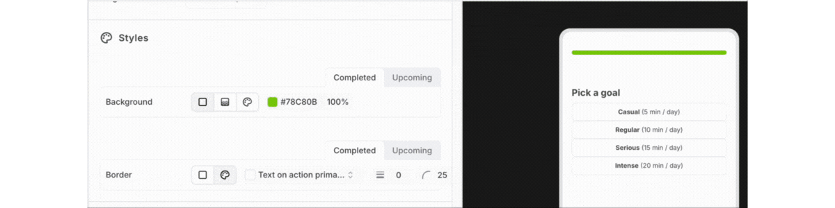
In addition, you can further customize the Progress Bar appearance by configuring:
- Background color to highlight the Progress Bar section
- Border color for clearer visual separation
Updated 7 months ago